CSC 308 GUI Conventions
These conventions describe the standard layout and presentation style for the
graphical user interfaces in CSC 308 requirements documents. The point of
these conventions is two-fold:
-
to provide very simple and straightforward drawing conventions, that can be met
using almost any basic drawing editor;
-
to provide conventions that are platform-independent in their look and feel.
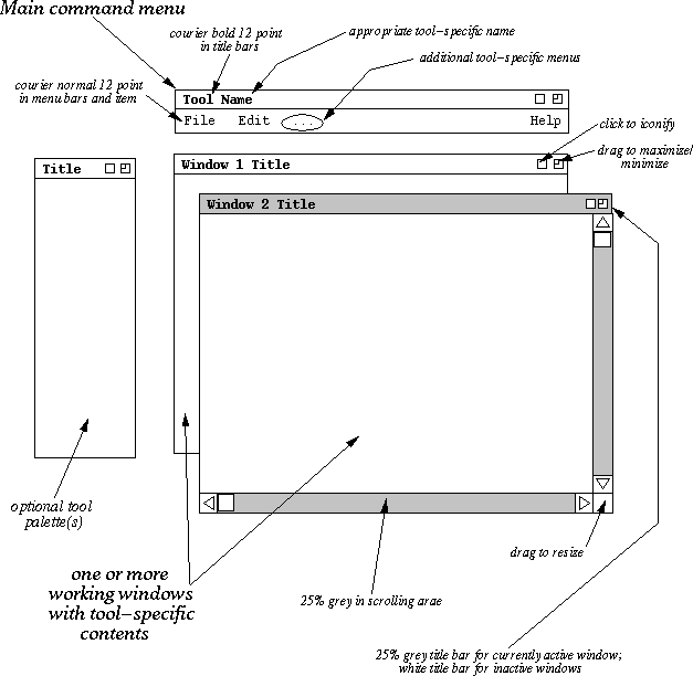
The overall screen layout for a CSC 308 tool is shown in Figure 1.

Figure 1: Elements of the standard 308 tool GUI.
The contents of all tool-specific windows must follow the general style
guidelines shown in the figure. Specifically:
-
window backgrounds are white, unless a another color choice is warranted
-
text font is black 12-point courier, unless another font choice is warranted
-
coloring of other UI elements is used where warranted
-
GUI widgets used in tool-specific windows are generally simple in style (see
further guidelines below)
The meaning of "warranted" with regards to font and color choice means that the
use of different fonts and colors must be based on specific improvements to
functionality, not solely on aesthetics.
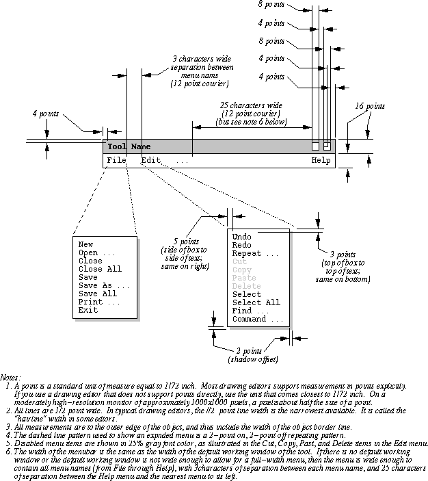
The standard command menu layout for all tools is shown in Figure 2.

Figure 2: Standard tool menus.
The contents shown for the File and Edit menus are expected to be standard for
all tools, unless tool-specific functionality warrants some change. Normally,
new functionality is added to the File and/or Edit menu by adding new items to
the bottom of the menu, separated by a horizontal rule from the existing items.
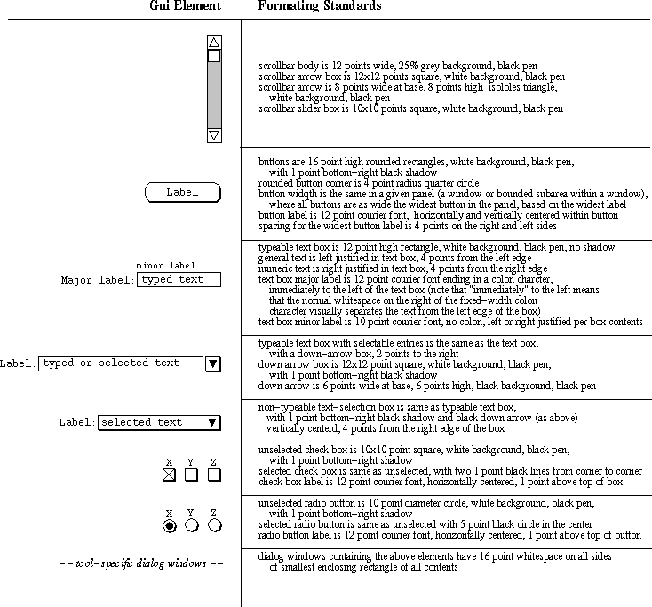
Standard GUI control elements are shown in Figure 3.

Figure 3: Formating Details for GUI Elements.
If a tool needs to use addition GUI elements, they must be rendered in a style
consistent with the standard elements.
If your team deviates from these conventions, the conventions that you use must
be clearly specified in the "Document Conventions" section of the requirements
specification document. In all cases, the GUI conventions must meet the
following standards:
-
They must be consistent throughout the requirements; that is, all members of a
team must use precisely the same drawing standards.
-
They must have a reasonably platform-independent look and feel.
-
They must follow the preceding guidelines for fonts, color, and general
simplicity of style.
-
They must provide for any and all forms of interface that are appropriate to
your project; in particular, you cannot limit the forms of user interaction to
those that happen to be available in a particular GUI-building tool. If you
use a GUI builder of some form, and it is missing UI features that are
important in your 308 project, then you must draw those missing features by
hand using some form of basic drawing editor.
index
|
lectures
|
handouts
|
examples
|
textbook
|
doc
|
grades
