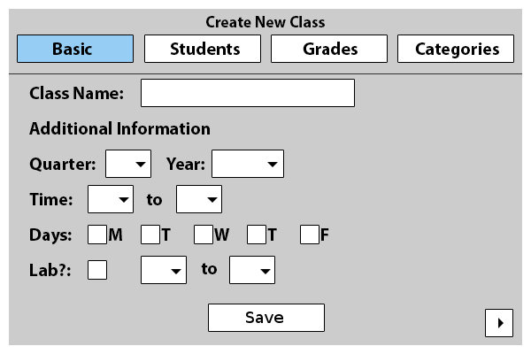
To create a new class, users should click Add Class+. In response, the program will display a window, shown in Figure 2.2.1.
Figure 2.2.1: Add New Class initial screen, defaulted to the Basic Info Tab.
The window consists of several tabs, labeled Basic Info, for basic class information, Students, for student information, Grades, for grading information, and Categories, to adjust grading categories. Each section is easily accessible by simply clicking on the desired tab. The window will be on the Basic tab by default.
Every tab has a save button on the bottom, which will create the new class and return the user to the home screen. Certain information must be entered before the class is created and if the user attempts to create a class before all required fields are filled, the user will be prompted to complete the information. The tabs themselves will be colored, indicating if they are complete with the most basic information(green), or if they still have some required information to be filled (red).
The Class Name field is a one line string that will be used to name the class. This is how the user will be able to identify this class.
The class name field is the only information that is require to be filled in this tab. The following are all optional information that the user can use to add more details will be left blank and the user can edit them in the future if they wish to do so.
The Quarter drop down list is used to identify which quarter this class takes place in. The four options are: Fall, Winter, Spring, and Summer.
The Year drop down list is used to identify which year this class takes place in. The options include the current year down to 100 years in the past.
The Time menus are used to indicate the start and stop times the class is in session.
The Days check boxes are used to indicate on which days the class is in session.
The Lab? check box is used to indicate if the class has a lab portion to it. If the box is checked, the two drop down lists following it are enabled and the user can choose appropriate times. If the box is left unchecked, the two drop down menus are grayed out, to indicate it is not applicable in this situation.
The right arrow button on the bottom right will take the user to the next tab, in this case the Students tab.
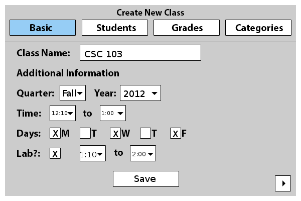
Figure 2.2.2: Completed Basic Info Tab
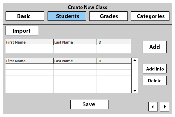
Figure 2.2.3: The Students Tab
Here in this tab users will be able to add in students to the class roster.
The first button is the Import button. This button will allow users to import class roster information from an outside source. Once the source is confirmed as appropriate, the program will auto populate the class roster.
If the user wishes to manually input student information, they may do so. The first row of fields is used to add students to the class. Under each category, the user is to input appropriate information. Under the First Name column, the user is to input a student's first name, and so forth. The only columns shown are those that are required in order to add a student. Once the user wishes to add the student to the official roster, the user can do so by clicking the Add button to the right.
Underneath the add student section is a view of the current student list. It displays all students currently added to the class and their appropriate information. The information is editable, that is if the user wishes to make a change to a student he can easily do so by double clicking the field and editing directly. The fields are sortable, in both ascending and descending order. The user can click on any column header and all the students listed will be sorted in ascending order based on that category, or in descending order if it is already listed in ascending order(according to the clicked category).
To the right of the list is a scroll bar, allowing the user to view all students as the list is populated.
Further right are two buttons: Add Info and Delete.
In order for these two buttons to be clickable, the user must have a student highlighted by clicking on the desired student.
Add Info allows the user to add any further information on a specific student Note: The specifics and the figure have yet to be discussed, however they will be implemented.
The Delete button deletes the highlighted student from the class list.
On the very bottom right, there are two buttons: A left arrow, and a right arrow. These allow the user to navigate to the previous tab (Basic Info) or progress to the next tab (Grades), respectively.
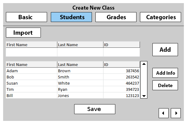
Figure 2.2.4: The Completed Students Tab
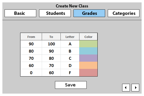
Figure 2.2.5: The Grades Tab
The grades tab is where the user can adjust how letter grades will be distributed in conjunction with point scores.
Here a table is represented, with four columns: From, To, Letter, and Color.
The From column holds the minimum number of points (inclusive) needed in order to receive the letter grade in the same row (under the letter column).
The To column holds the maximum number of points (exclusive) needed in order to receive the letter grade in the same row (under the letter column).
The Letter column is the letter grade that will be given based on the From and To categories.
The Color column is for the user, to help identify grades by associating them with a certain color. The user can choose any color within the given color picker that is shown if the color is double clicked.
The table is initially filled with the most common grading scheme, that is 90-100 an A, 80-90 a B, and so forth. Default colors are also chosen.
The user is able to edit any of the information directly in the table, and checking to make sure no boundaries cross will be provided.
On the very bottom right, there are two buttons:A left arrow, and a right arrow. These allow the user to navigate to the previous tab (students) or progress to the next tab (Categories).
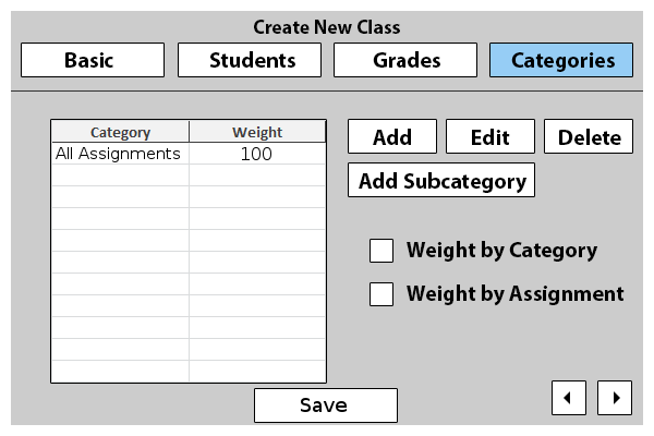
Figure 2.2.6: The Categories Tab
The Categories tab is where the user can create categories that will be graded with specific weights. If this section is left completely blank, a default All Assignments category will be created, with a weight of 100%.
Here a table is represented, with two columns: Category and Weight.
The Category column contains the title of the category the user has created.
The Weight column contains the weight the category will have in the overall class (Given "Weight by Category" check box is enabled).
To the right of the table are several buttons. These include: Add, Edit, Delete, and Add Subcategory.
The Add button allows the user to add another category to the list. There will be checks to make sure the total weight does not exceed 100%.The Edit button allows the user to edit the highlighted category they have clicked on.
The Delete button allows the user to delete a previously entered category.
The Add Subcategory button allows the user to add a subcategory to any current category.
Under the buttons are two check boxes: Weight by Category, and Weight by Assignment.
If the Weight by Category box is checked, then specified categories will be weighted according to their entered weights.
If the Weight by Assignment box is checked, each individual assignment will be weighed differently from others in its category. When used with the Weight by Category box, the user will be able to specify how much each assignment counts in relation to others in the same category.
On the very bottom right, there is one button: A left arrow. This allows the user to navigate to the previous tab (Grades).

Figure 2.2.7: The completed Categories Tab