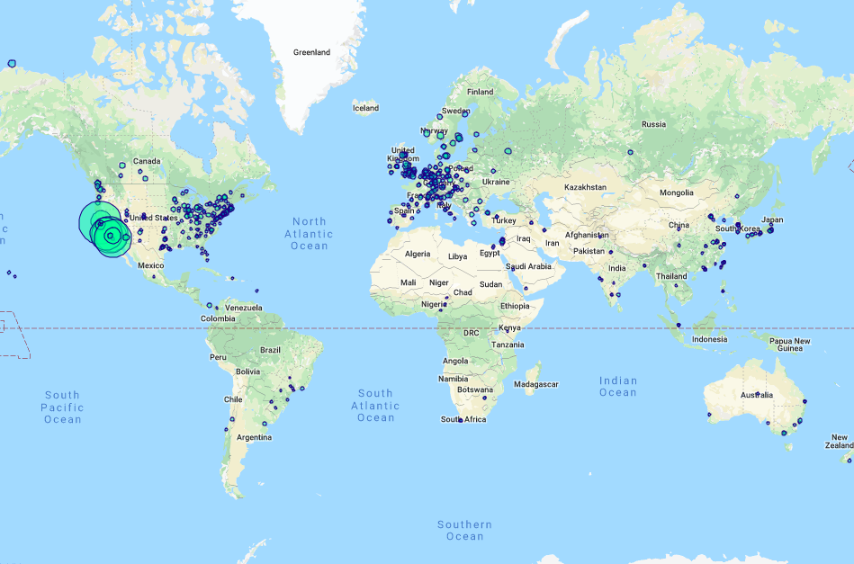
Using the GoogleMaps API, we mapped institutions that have published computer science research papers. If two institutions have two authors that have coauthored a paper, then those institutions are connected via an edge. We note that many institutions tend to faithfully publish with authors of the same institution. To account for this, we size institution based on their publications field, but also include the field degree to represent the number of edges leaving an institution. To account for the sheer size of the data, we do not draw multiple edges, so if multiple publications have been authored with the same university, this is represented with only one edge, but accounted for in the degree field. While these maps are interactive, the size of the data greatly taxes our browser, so we include images for quick examples and links for those who would like to view the data in greater detail.
Joint work documented here: "Mapping and visualization of publication networks of
public university faculty in computer science and electrical
engineering" (Carroll et. al.)
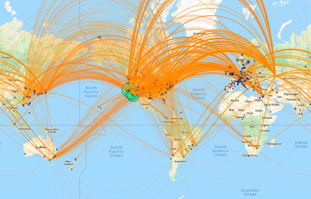
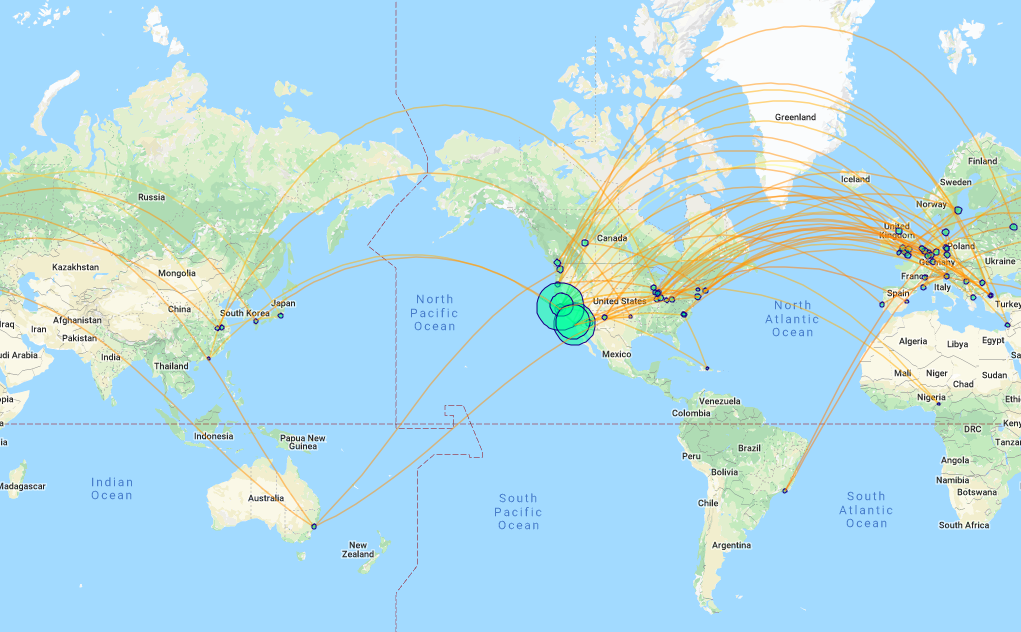
All the Data
Above is an image of the current data with all the edges being shown. The link to the map can be found here.
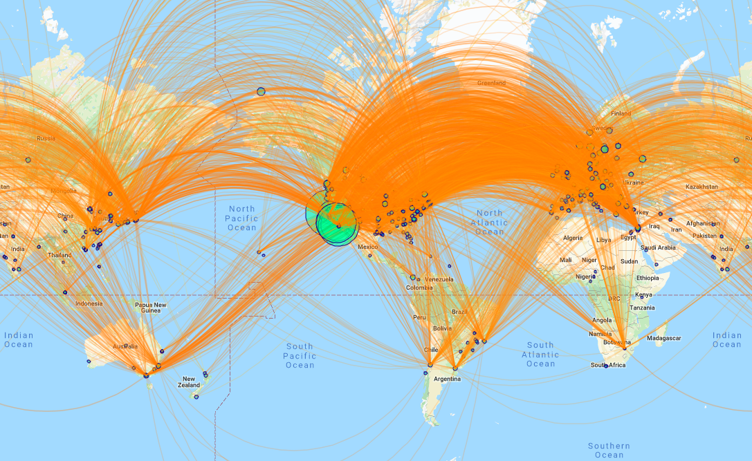
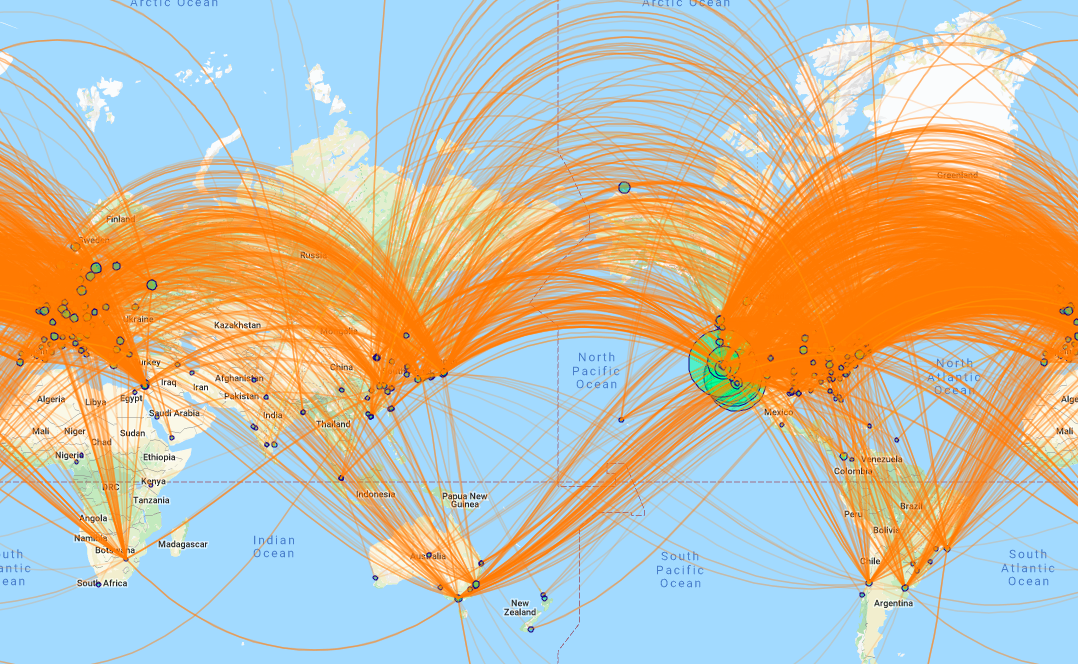
Merging Data
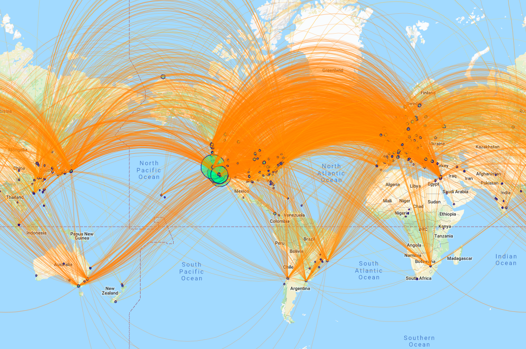
To help us manage the high degree in institutions, we have the opacity of the edges decrease as the maps is zoomed in. In addition to this, we took several regions of high activity (this was just determined visually), and merged then as a single vertex in order to observe the behavior of edges around these regions.Merging California
 See the map that merges all the institution in California.
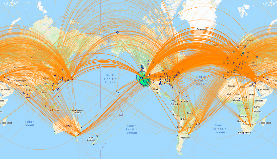
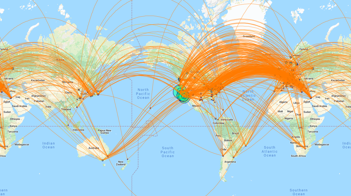
Merging the US east coast
 See the map that merges all the institution on the east coast.
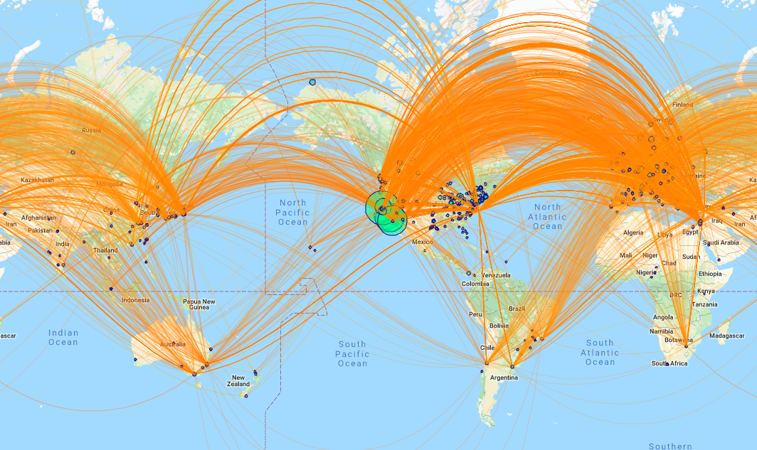
Merging Europe
 See the map that merges all the institution in Europe.
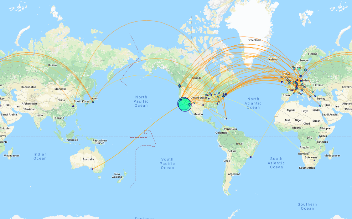
Two-Step Neighborhoods
We also considered two-step neighborhoods about an institution. In doing this, we target a particular institution, and draw an edge between institutions if: (a) one of the institutions is the target one, or (b) if either institution is a neigbhor of our target institution.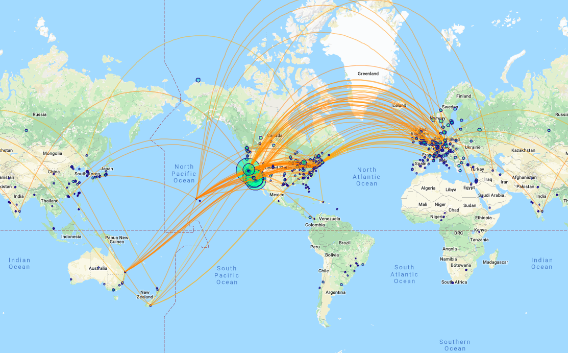 The above image shows two-step neighborhood about the University of Otago in New Zealand. A link to the map can be found here.
 The above image here shows the neighborhood about UC Berkeley. An link to the map is here.
Random Walks
We next explored viewing the map using random walks. This process involves specifying a start location and a number of steps, and allowing the "walker" to wander until it uses up it's step count. We determine how the walker moves by randomly picking an edge to traverse based at whichever institution the walker is currently located. The maps below only draw an edge if it was traversed by the random walker.UC Berkeley - Steps: 10,000
 The image above is a random walk of 10,000 steps starting at UC Berkeley. The map can be found here. We note that as we allow our steps to go to infinity, we will converge to the full map. Hence, we next worked on restricting the walk severely.
UC Berkeley - Steps: 100
 Observe the interactive map here.
University of Otago - Steps: 1,000
Given that UC Berkeley is a high activity vertex, we juxtapose the two earlier examples by applying random walks to the University of Otago in New Zealand and the University of Witwatersrand in South Africa.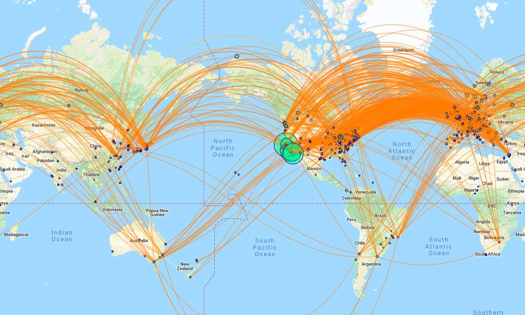 Interactive map.
University of Witwatersrand - Steps: 1,000
 Interactive map.
University of Witwatersrand - Steps: 100
 Interactive map.