Slices of Pie
Volumetric rendering and ad hoc data collection.
Prior Work
My main focus with ICEX this quarter was on visualizations of scientific data gathered by the ROV. In this context, "Scientific Data" refers to measurements of temperature, salinity, etc. taken at short intervals (ideally about once per second) during the deployment. We planned to use Smart Tether deta to associate accurate position data with these readings, but didn't account for the fact that the Smart Tether was both poorly designed and ineffective. After localization, we have a large collection of data points with associated sensor readings, and my task was to make these readings visible in a coherent and contextualized manner.
This is a project that I've actually already put a lot of work into – this past summer, I worked with Zoe to produce visualizations of data gathered on previous ICEX missions and other projects. One data set I focused on in particular was some oxygenation data sampled from Hopavagen Bay in Norway. I'll be including pictures from that data set in this post as examples of the sort of analysis I'll be doing with the data collected this year in Malta.
Starting with the initial data set, one of the simplest visualizations that can be done is simply drawing each individual point from the set. This is often called a point cloud or glyph view. [1]
This is a straightforward but ineffective way to view the data as a whole. However, it's a good place to start and also a useful addition to any other sort of visualization since it provides the most direct view of the original data set. The next visualization to add is called a volumetric view; it takes on the appearance of a nebulous, transparent cube which is colored to indicate trends within the 3D space of the data measurements. It requires some extrapolation to create, so it's good to include the original data points in this display as well. [2]
This view makes patterns within the data a bit easier to see, but only on the outer edges of the data range – we can't see what's going on inside the cube very well! Luckily, it's easy to apply transformations to the volume view that allow us to isolate certain features within the data. One example of such a transformation is a slice-by-slice view, but a more interesting way to view the data is by isosurface [3]
We're getting close to an effective visualization of the data, but we're missing one crucial factor – context! These sensor readings came from a bay in Norway, but you can't tell that by looking at any of the above images. To solve this, we can add in some terrain data acquired from satellite imagery and GIS data sources [4]
-
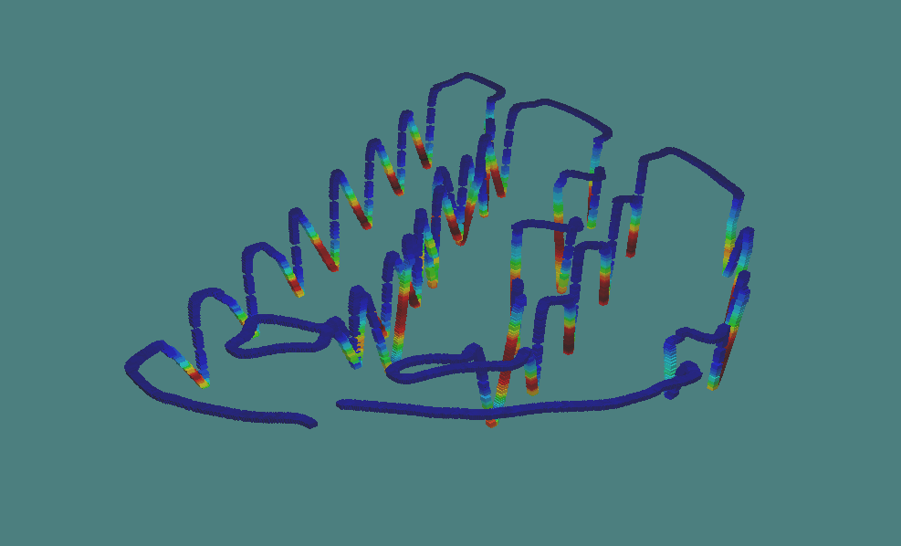 1 One small colored cube for each point in the data set. Here, red colors indicate high oxygenation and blue colors indicate low oxygenation.
 -
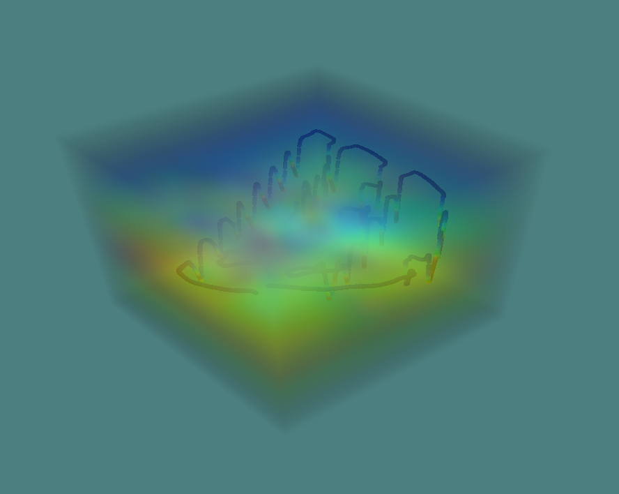 2 Volume render with point cloud context.
-
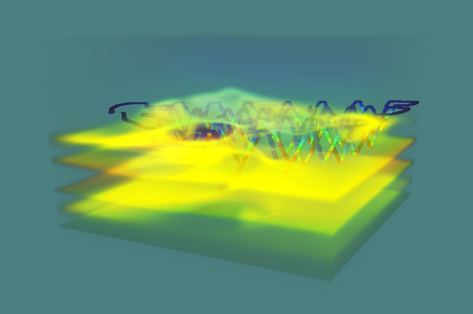 3 Only areas of the data volume which have a certain sensor value are shown, making it easy to search for internal patterns within the data.
 -
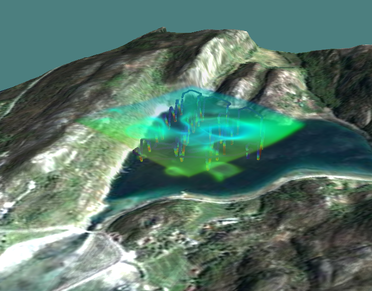 4 Geographic context!
Project Details
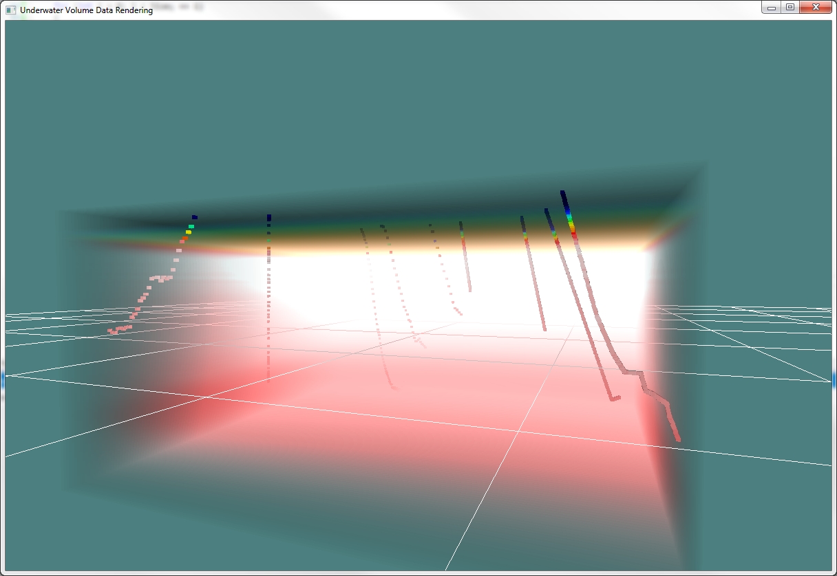
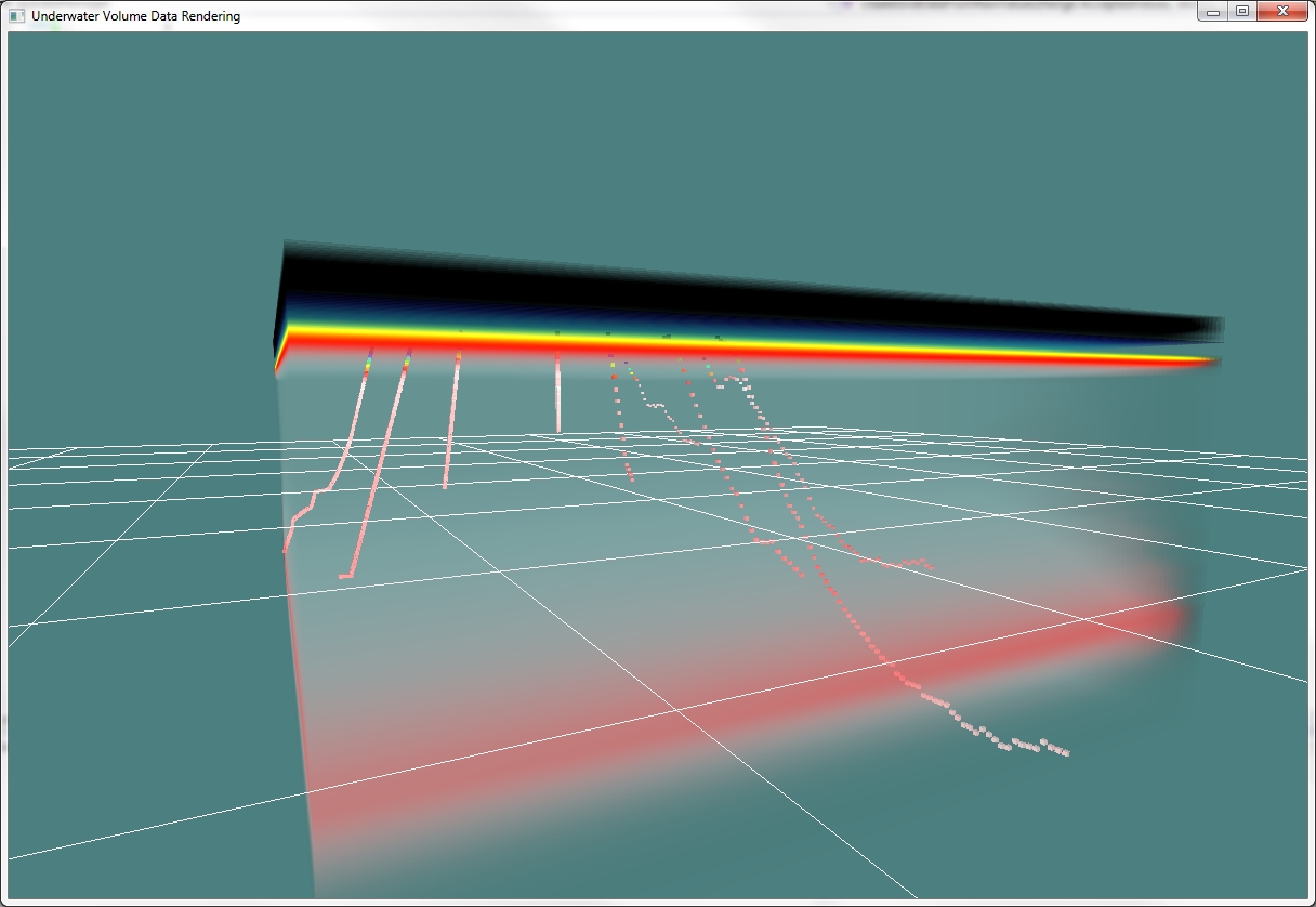
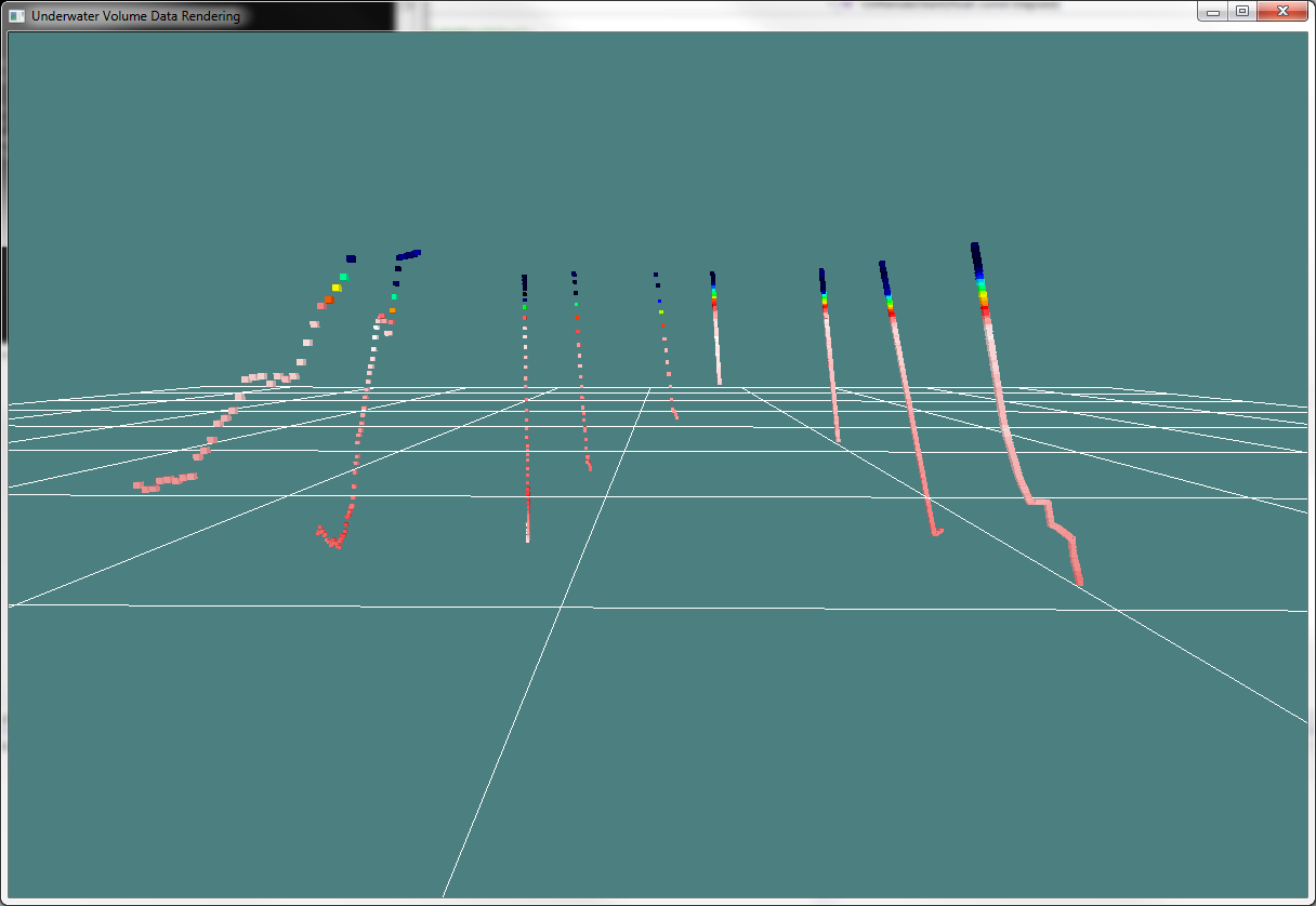
At the St. George's Bay Cave site, we were able to collect accurate depth data from the SmartTether (for the most part), but were not able to rely on the XZ (lat long) position data. In order to colect point samples from which to generate a volume, we made extensive use of careful timing, detailed log book drawings, tether length measurements, and the collected depth data to artificially but reliable construe the 3D positions for two days worth of HOBO data points.
The resulting data set is somewhat sparse (geometrically) but shows a consistent relationship between depth and temperature. This relationship is not highlighted well by the RBF interpolation method, which characterizes smooth and general trends in the data. For visualizing this particular data set, an alternate volumization method was developed.
This alternate method was slice based, generating interpolated values by examining points at similar depths. While the method tends to produce volumes with strictly vertical trends, the algorithm takes into account XZ locality as well as Y. The vertical trends seen are largely an artifact of the acquired data.
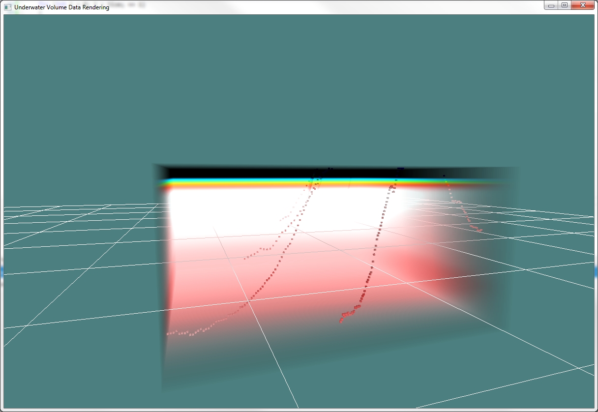
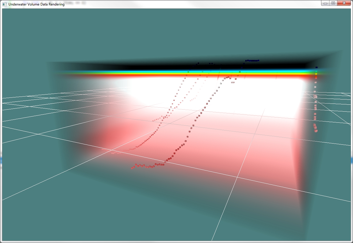
Screenshots (Data)
Screenshots showcasing the collected data and generic RBF volume.
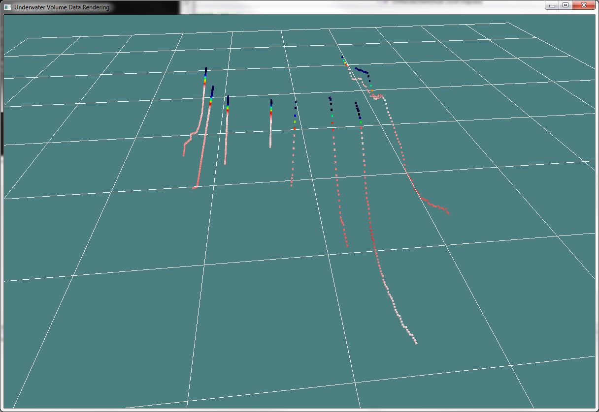
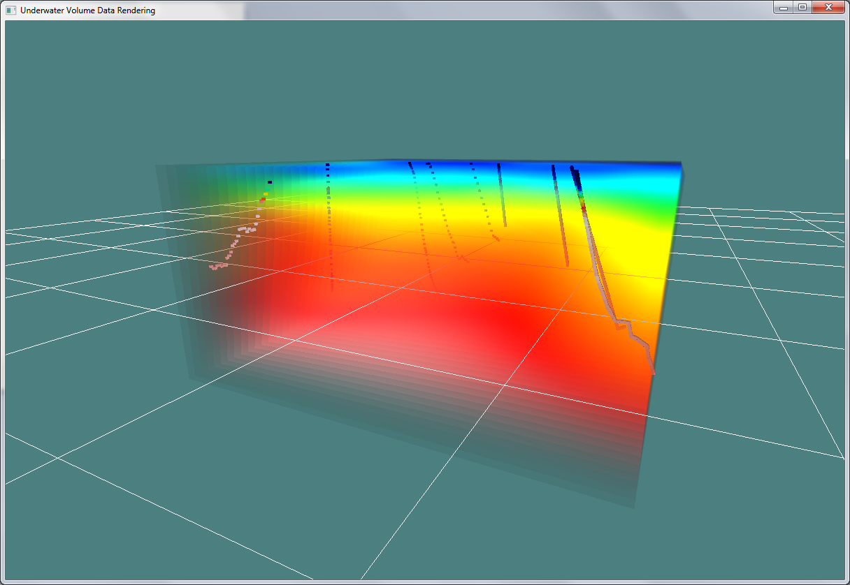
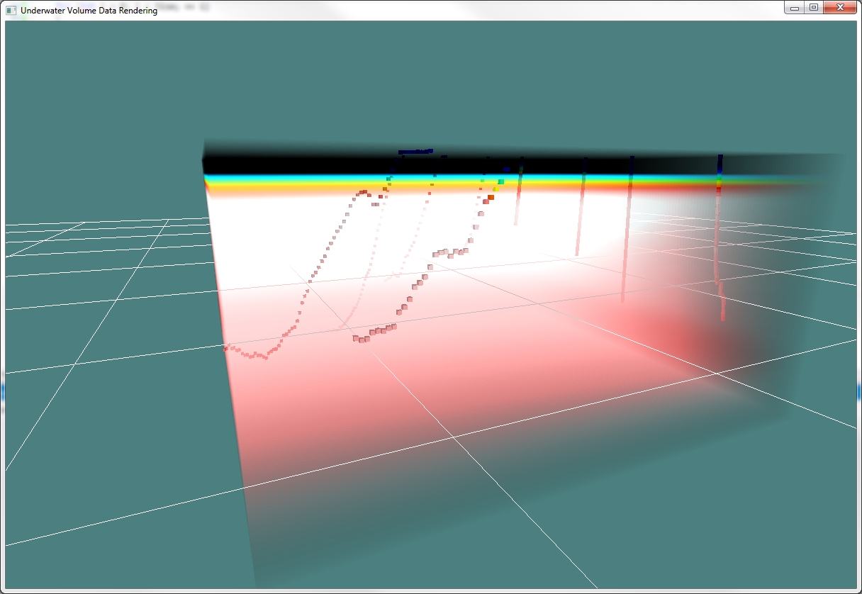
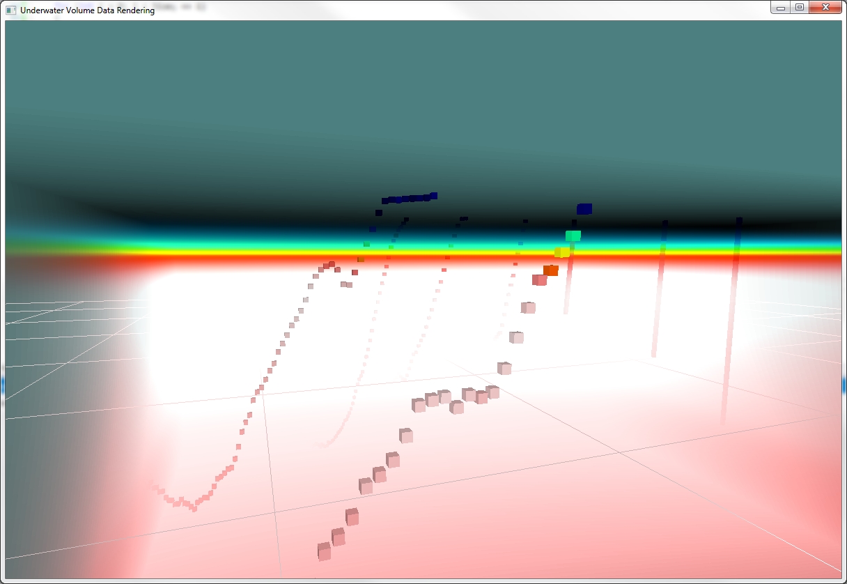
Screenshots (Slice-based volumizing)
Screenshots showcasing the new volume method for this data set.