Satellite Data Visualization Application
Introduction Usage Lessons Learned Future Work Testimonials Downloads


Developed by Jason Anderson

Supervised by Dr. Zoё Wood

CSC 572, Fall 2008 Final Project

Introduction

Currently, there is no cheap alternative for satellite data visualization products available in the market. For the Cal Poly research project, PolySat, this is an issue as they are limited to simple 2D Excel graph analysis of their on-orbit satellite data. To enable more indepth satellite data analysis, the Satellite Data Visualization Application was created.


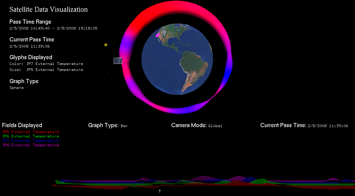
Screenshot showing two temperatures plotted on orbit with a bar graph of other temperatures below


The Satellite Data Visualization Application allows users with satellite data to plot multiple data axes onto an orbit. Not only is there information in the selected axes but the visualization also provides
  • Time
  • Lat/Long Position
  • Azimuth/Elevation
  • Sun Location
Combinding all this information enables humans to easily interact with satellite data. Currently data is read from of a .csv file but was written such that many different data sources could be utilized(ie. databases). The software also accounts for dropped packets which is unavoidable in real world applications due to unreliable communication links.


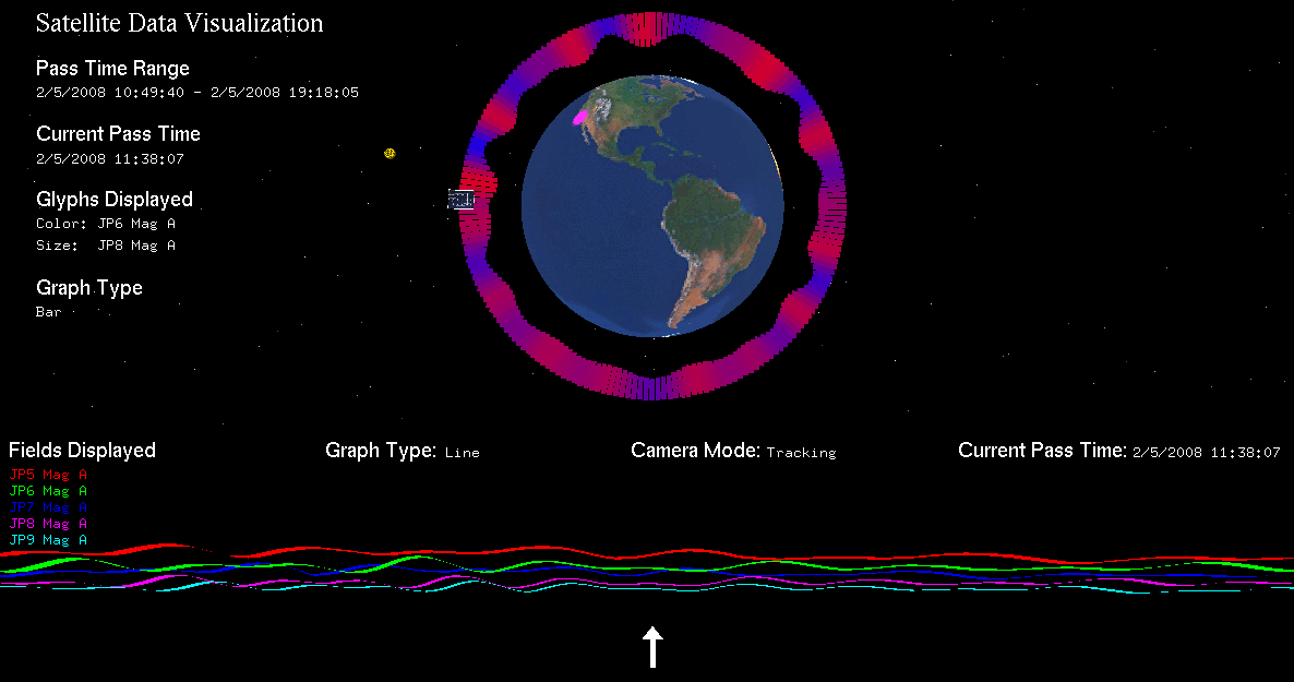
Screenshot showing the fluctuations in the Earth's magnetic field with an eye-level comparison graph below


Usage

The Satellite Data Visualization Application has many features. A few are listed below.
  • Display multiple axes of satellite data placed with respect to time on a realistic orbit
  • Display satellite data on three different types of traditional 3D graphs
  • Multiple orbit/graph drawing modes
  • Ability to select/deselect axes to be shown
  • Ability to reorder graph axes for easier comparison
  • Multiple dynamic camera views
The following table lists all the key commands available in the program.

Graph Keys
pToggles glyph selection screen
rToggles field reordering screen
dToggles fields to show screen
gToggles graph drawing
-Toggles graph camera mode
t / TTilt the camera*
x / XMove along the x axis*
y / YMove along the y axis*
z / ZMove along the z axis*

Submenu Keys
aWhen selecting fields to show, selects all
cWhen selecting fields to show, selects none
1Select color glyph
2Select size glyph
<enter>Select current highlighted item

Orbit Keys
oToggles orbit drawing
sToggles stars
eToggles earth

* Only supported in global camera view since tracking view takes control of position and orientation


Lessons Learned

Throughout the course of this final project there have been many challenges and lessons. The following list is just but a few of them.
  • LEO Satellites: During this project I discussed the topic of satellite orbits with many aerospace students/professors. A satellite's orbit is defined by its TLE which not only defines the plane of the orbit, but also the satellite's current position in that orbit at a given time.

  • Data Visualization: Since the Satellite Data Visualization Application heavily relies on scientific visualization, research was conducted into how to display multiple axes of data at one time. To do so requires glyphs which represent a range of values as varying colors, shapes and sizes.

  • GLUT's Subwindows: Throughout the project I have dealt with many issues regarding GLUT's Subwindow functionality. While they accomplish my goal of having two world coordinate systems that are completely separate from each other, they are difficult to use because of their current window concept. In order to accomplish any GLContext specific functionality, the context must be the current window's. This makes it difficult to have cross communication between subwindows dealing with changes in the OpenGL context.


Future Work

As the quarter system only allows for so much development time, there are a number of improvements which could be easily added into the existing framework. The list is as follows.
  • Improved Data Orbit Visualization: The current method of displaying satellite data fields is through the size and color of the orbit. To enable more interesting glyphs such as the curvature of the orbit, graphics programs called Shaders written in a shader language like CG are needed. Shaders will give the most flexibility for visualizing the scientific satellite data.

  • Satellite Attitude Support: One of the main issues that CubeSat developers are trying to determine is the CubeSat's orientation in space. Currently methods such as the Kalman filter are being used to solve the attitude problem. One interesting question is whether a Human supervised Kalman filter would be an improvement due to the extra human knowledge gained by the visualization.

  • Model the Tilt of the Earth: Currently the visualization does not account for the tilt of the earth. Adding this parameter based on the time of year will allow for a more accurate model which will more clearly show correlations between data fields.


Testimonials

The following responses were received when the Satellite Data Visualization Application was shown to aerospace students and faculty.
  • “A great tool for visualizing correlations between data. I don't know of anywhere else where you can graph data in such a way. Pretty intense!” (Ryan Nugent, 5th Year 4+1 Aerospace Student)


    Ryan Nugent enjoying the Satellite Data Visualization Application

  • “A unique data visualization concept.” (Dr. Jordi Puig-Suari, Aerospace Department Chair)


Downloads

The following links allow visitors to download the project's source, Windows/Linux compiled executables as well as videos of the project in action. Due to the video capture software used(Fraps), it is unable to capture both GLUT subwindows at the same time. Therefore the two videos below each are of a different project subwindow.
 
Final Project Source
Linux Executable
Windows Executable
 
Video showing the Orbit simulation
Video showing the Graph use