This project is an attempt to improve visualizing if data is subject to Simpson's paradox. Simpson's paradox occurs when grouped data has an opposite trend from the total aggregate. This occurs when there's a lurking variable present, like data weights. Most visualizations fail to show data values and their weights at the same time.
The first attempt is an improvement of the comet chart. The comets in the chart represent data at two different time periods. The tip of the comet is the start and the wider tail is the end time. Blue and orange colors mean that the data weight is either heavily skewed one side or another. In the below comet chart, many items are grey on the left side because it's using a log scale.
The comet chart has two major pitfalls. First, it can only show two date differences. Second, and most importantly, it's difficult which direction small comets are pointing. For example, the black aggregate comet is so small it's essentially a triangle. Both of these shortcomings can be fixed by making the chart 3D, since the depth can allow an arbitrary number of time steps and small comets can be rotated to determine their position. The 3D representation removed the comets however sine the direction of time flow is more obvious with a dedicated axis.
The comet chart on the left is a prototype version that one of the creators sent me. She told me the full version wasn't
available for distribution. The data set involves new born baby's weights, broken up by state. The only interactivity
is seeing more information about the data facets by hovering over each comet. The full version described in the paper
has much more interactivity enabled.
The 3D comet chart to the right is the exact same data set. Dragging the mouse left and right will rotate the data,
and holding the y key allows tilting up and down as well.
Clicking the data set drop down toggles which data is being viewed. The second and third data sets are unemployment
data for different market segments. The sharp color and position difference signals that the market segment weights
- the market size in this case - are changing and can skew aggregate results.
The 3D comet chart is made with WebGL. It's essentially three components, each with a separate shader. The axes
are the first component; they are simply a few vertices with indices connecting them into the familiar 3D cartesian
plot. The data lines are the next component, where each line has a custom color depending on how much the weighted
category has changed. For the employment data, I added support for an arbitrary number of time steps in the data.
Finally, there's the axis labels. Each label is a textured plane carefully positioned over the proper axis. The
texture is generated using a Canvas that has text set on it. WebGL can take a canvas directly as
a texture, making text manipulation very easy.
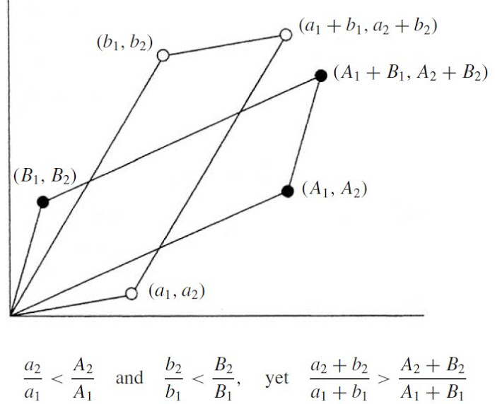
The bottom two visualizations were my attempt on visualizing Simpson's paradox data that doesn't have a time component. It's data from a case in Berkley in the 1960s where more men then women were admitted overall, but for most departments women were accepted in higher numbers. The lurking variable is the amount of women and that applied to each department is different. Women applied to more selective departments so while they were accepted to them more than men they were still rejected more overall.
The Vector Visualization colors lines pink or blue according to if more women or men were admitted to a department. The large line is the aggregate however, so overall most departments admitted more women. The components was an attempt to replicate this image but with multiple categories instead of just two. Lining up the vectors head to tail however didn't produce an interesting visualization.
This project allowed me to cultivate a good software development base for future WebGL work. I learned how to use Bower to install and manage client side packages and bower to automatically include them in the main HTML file. I also set up a reliable system to import shaders from external files. It's surprisingly difficult to store shaders to use with WebGL; many examples store the shaders in script tags on the main HTML page. This makes managing shaders unruly as more and more get added. Most importantly for me, I lose syntax highlighting if shaders are not in a separate .glsl file.
The idea for this project comes from the paper Visualizing Statistical Mix Effects and Simpson's Paradox which pioneered the comet chart, along with formalizing the issue and giving ideas about future work. I use twgl as a thin wrapper around WebGL. It makes the API less verbose and includes helpful additions like libraries to multiply 4x4 matricies and generate common geometric primitives. Finally, this tutorial helped me to get text in my WebGL application.