2.6. Curve Options
This introductory scenario shows an individual user using the curve functionality in professor view.
These options will be used to adjust grades and display them graphically.
2.6.1 Pie Chart
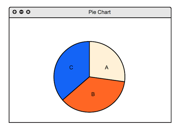
To view a pie chart of current grades, the user selects the Pie Chart in
the Curve menu, whereupon the system displays the chart shown in
Figure 2.6.1.

Figure 2.6.1: Pie Chart.
The title field is a one-line string that describes the chart briefly.
The pie chart shows grades sorted into letter categories. The categories can be expanded or compressed
based on what the user wishes. To adjust all other graphics, the user drags the categories to the required amounts
and presses the Update button. To save the adjusted grades, the user presses the Save button.
To cancel the changes, the user presses the Cancel button.
2.6.2 Histogram
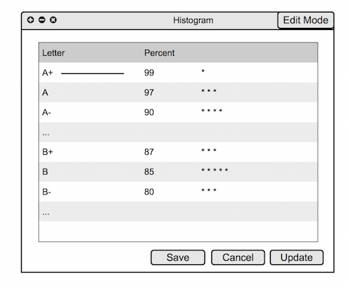
To view a histogram of current grades, the user selects the Histogram in
the Curve menu, whereupon the system displays the chart shown in
Figure 2.6.2.

Figure 2.6.2: Histogram.
The title field is a one-line string that describes the chart briefly.
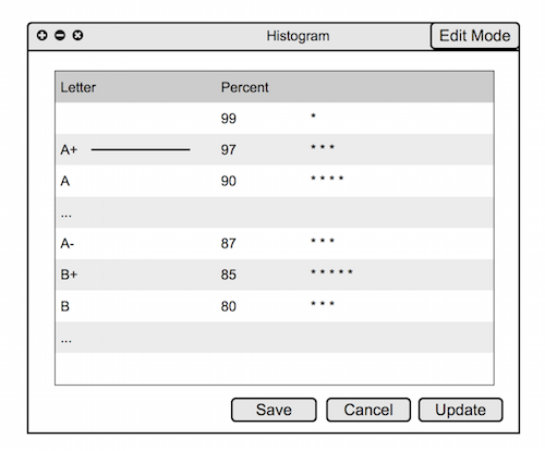
The histogram shows grades sorted into categories based on percentage. There are lines marking where the cutoff for a certain letter grade is. This line can be dragged up or down to adjust the grade distribution. (see Figure 2.6.3 for adjusted histogram)

Figure 2.6.3: Adjusted Histogram.
To adjust all other graphics, the user drags the categories to the required amounts
and presses the Update button. To save the adjusted grades, the user presses the Save button.
To cancel the changes, the user presses the Cancel button.
2.6.3 Modifying the Grade Scheme
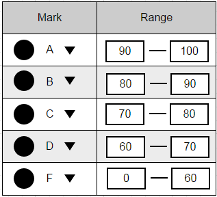
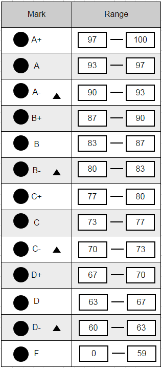
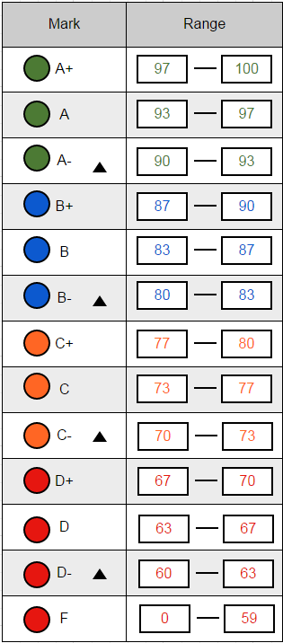
From the top level Grades menu (shown in Section 2.1: UI Overview), the instructor selects Grade Scheme and a window containing Figure 2.4.5.a appears. The instructor can expand each letter grade to modify the individual ranges for each grade subsection (A+, A, A-, ...). Also Colors can be assigned to each grade with the color picker which will affect the visuals associated with that grade in the various visual representations of the grade scheme.
