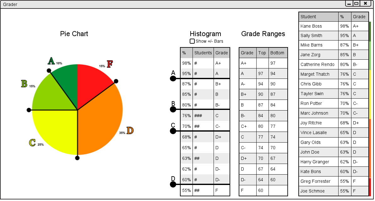
The Grade Ranges is on the right side of the user interface. It shows the percentage range for each letter grade. It can be seen below in figure 2.6.3.a.
Figure 2.6.3.a: Graph User Interface.
This allows the user to specify the grade ranges for each letter grade. For example if the user wanted to make more students with D grades have C grades they type in 65 in the bottom column of C- or the top column of D+. The result of that action is shown in figure 2.6.3.b below.
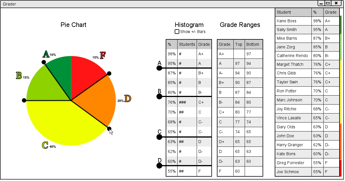
Figure 2.6.3.b: Result of Changing Letter Grades.
As the user can see, the user interface has been updated in many places. First, the Pie Chart has been updated with the changed letter grades. Second, the pie chart on the left hand side of the user interface has been updated to show the percentages of students with sifferent letter grades. Lastly, the student list on the right had side has also been updated with new letter grades and new colors representing the proportion of students with each grade.