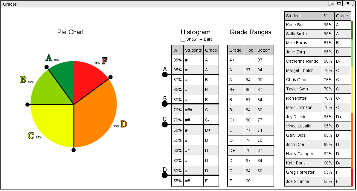
The Pie Chart is in the left side of the user interface. It shows the percentage of students with each letter grade. It can be seen below in figure 2.6.2.a.
Figure 2.6.2.a: Graph User Interface.
Like the histogram, the bars with circles on the ends can be dragged around the circle to change the final letter grades of students in a grade book. For example if the user wanted to make more students with D grades have C grades they could drag the handle between the C grades and D grades farther into the D region. The handle should snap to the possible places it can be. The result of that action is shown in figure 2.6.2.b below.
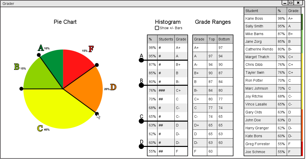
Figure 2.6.2.b: Result of Changing Letter Grades.
As the user can see, the user interface has been updated in many places. First, the Pie Chart has been updated with the changed letter grades. Second, the pie chart on the left hand side of the user interface has been updated to show the percentages of students with sifferent letter grades. Lastly, the student list on the right had side has also been updated with new letter grades and new colors representing the proportion of students with each grade.
If a user moves one of the handles so that no students have one of the letter grades (for example the grade D), the handle will then have two cicles at the end as shown below in figure 2.6.2.c.
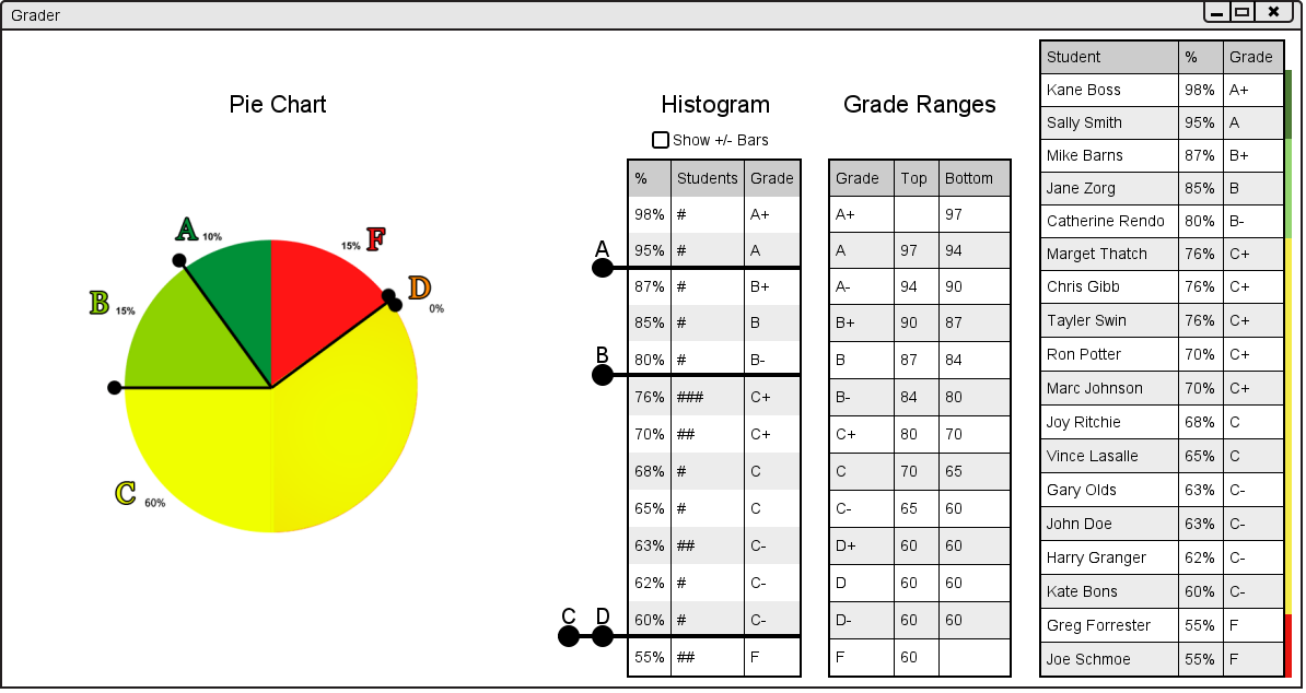
Figure 2.6.2.c: Result of Removing a Letter Grade.
Once agian, as the user can see, the user interface has been updated in many places. First, the Pie Chart has been updated with the changed letter grades. Second, the pie chart on the left hand side of the user interface has been updated to show the percentages of students with sifferent letter grades. Lastly, the student list on the right had side has also been updated with new letter grades and new colors representing the proportion of students with each grade.
Identical to the histogram's functionality, if the user grabs a dot that is sharing the same bar as a higher dot, and drags up, it will take the higher dot up with it.
If the user were to have more than one bar on the pie chart overlapping the result would look like figure 2.6.2.d below.
Figure 2.6.2.d: Result of Multiple Overlapping Grade Ranges.