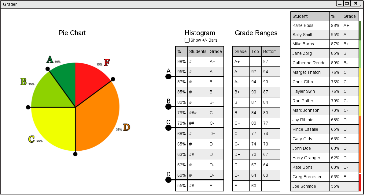
The histogram is in the middle of the user interface. It shows the percentages, grades and number of students for each percentage. Each "#" symbol represents a student. It can be seen below in figure 2.6.1.a.
Figure 2.6.1.a: Graph User Interface.
The bars with circles on the ends can be dragged to another area between two rows to change the final letter grades of students in a grade book. For example if the user wanted to make more students with D grades have C grades they could drag the handle between the C grades and D grades two rows below. The result of that action is shown in figure 2.6.1.b below.
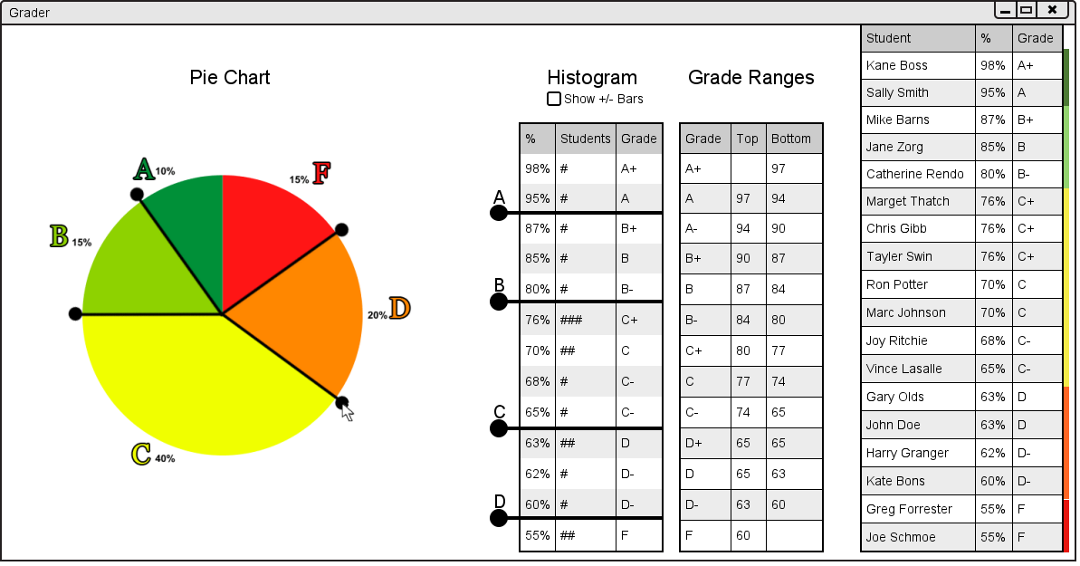
Figure 2.6.1.b: Result of Changing Letter Grades.
As the user can see, the user interface has been updated in many places. First, the histogram has been updated with the changed letter grades. Second, the pie chart on the left hand side of the user interface has been updated to show the percentages of students with sifferent letter grades. Lastly, the student lis on the right had side has also been updated with new letter grades and new colors representing the proportion of students with each grade.
If a user moves one of the handles so that no students have one of the letter grades (for example the grade D), the handle will then have two cicles at the end as shown below in figure 2.6.1.c.

Figure 2.6.1.c: Result of Removing a Letter Grade.
Once agian, as the user can see, the user interface has been updated in many places. First, the histogram has been updated with the changed letter grades. Second, the pie chart on the left hand side of the user interface has been updated to show the percentages of students with sifferent letter grades. Lastly, the student lis on the right had side has also been updated with new letter grades and new colors representing the proportion of students with each grade.
If the user were to click on the Show +/- Bars checkbox as seen in figure 2.6.1.c above, the histogram would be updated to include bars for + and - letter grades as shown in figure 2.6.1.d below.
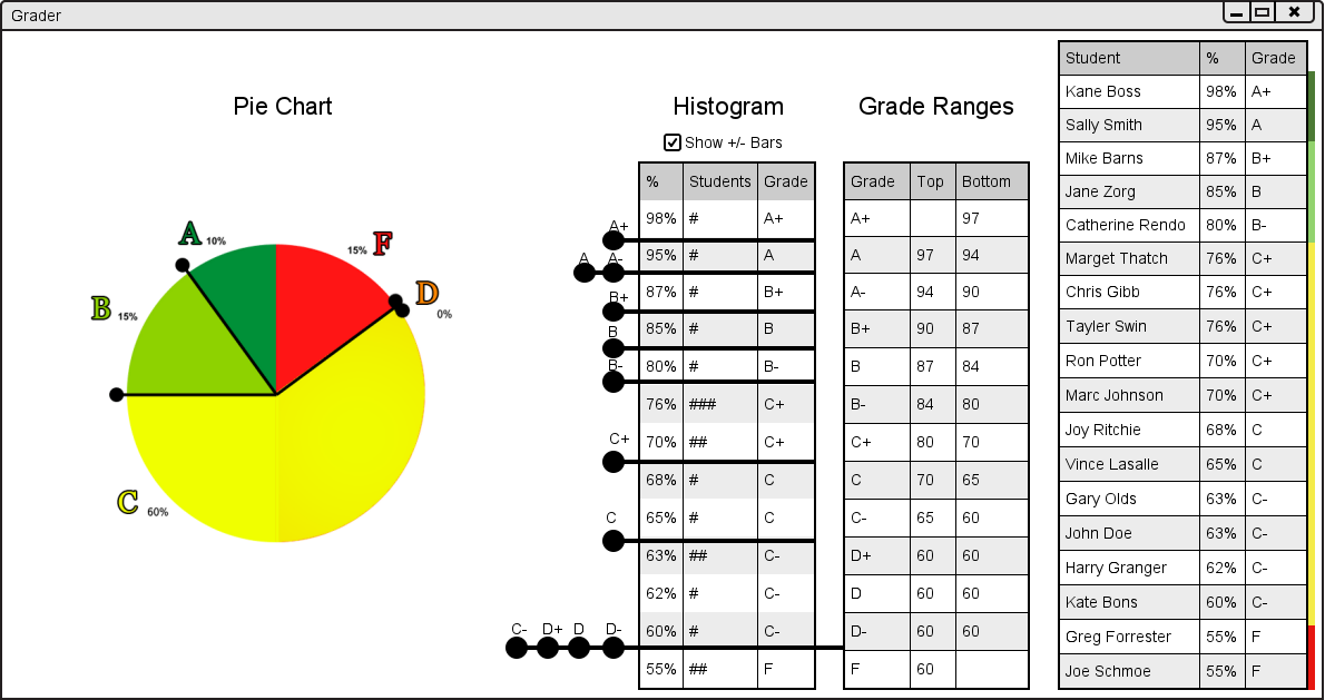
Figure 2.6.1.d: Result of Clicking on the Show +/- Bars Checkbox.
This allows the user to change the grade ranges for letter grades including + and - grades.
You should also notice an example of what happens when more than 2 grade range bars are on top of each other. If the user was to grab an inner dot, for example the A- dot, as shown in figure 2.6.1.d above, and drag it up, then the outter dots, ie the A dot, would come with it as shown in figure 2.6.1.e.
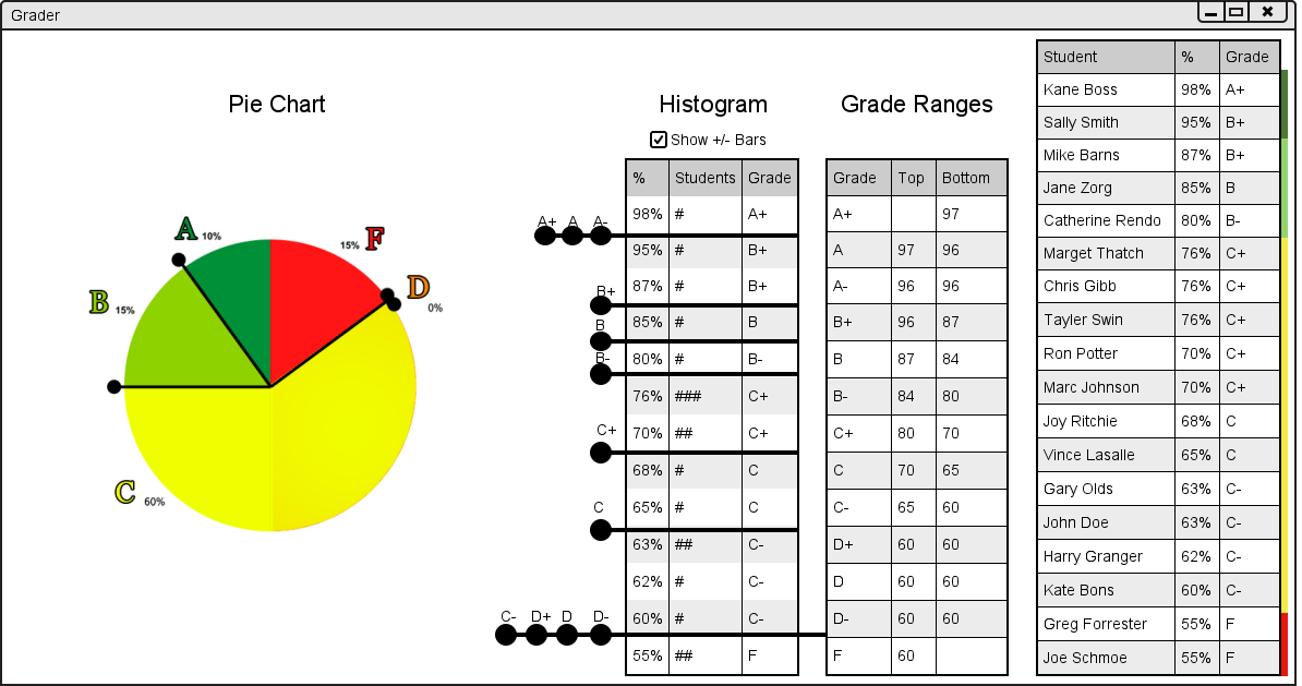
Figure 2.6.1.e: Result of a Letter Grade Range that is Below Another.
But if the user was to drag the outermost dot only, (ie the A dot in the previous example) that dot would be moved as shown in figure 2.6.1.f below.

Figure 2.6.1.f: Result of a Letter Grade Range.