2.5.3 Viewing a Grading history
This scenario shows the user how to use the teacher grading history
graph. The teacher grading history graph is a bar graph showing the
highest grade, lowest, mean, and average grades recieved in a range of
quarters. In the main menu the user must select
graphs->teacherhistory. This will bring up Figure 2.5.3.1 shown below.
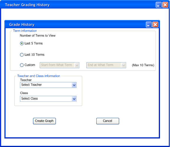
Figure 2.5.3.1
The first option is the number of terms to view. The first two standard
options are to view the last 5 terms and the last 10 terms. The user
also can view any terms up to 10 terms max. As shown in Figure 2.5.3.2 below.
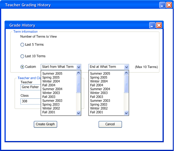
Figure 2.5.3.2
The user then types the professor's name and the class he wishes to
see. After all the options are filled the user then clicks the button
create graph.
Then the graph will look similar to Figure 2.5.3.3.
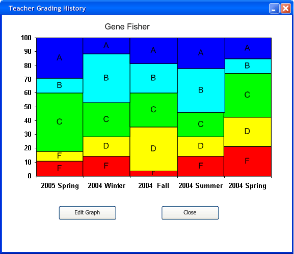
Figure 2.5.3.3
This graph shows what percent of students received each letter grade. The larger the colored box of the lettergrade the more percent of the students received that grade. The user then can either edit the graph again or close the graph after he/she is finished.
Prev: Changing
the curve using the PieChart | Next: None |
Up: Graphs | Top: index