2.5.2 Changing the Grade Curve by using the Pie Chart
This scenario will show the user how to use the Pie Chart. The Pie
Chart is a diagram showing how many students received a certain grade.
The highest grade starts from the 12 o'clock position. The grades move
down in order in a clockwise fashion. The pie chart shows the user how
many students received each grade in a graphical fashion.
To use the pie chart, the user must first set the Grading Threshold. The pie
chart shows what percent of the class is getting what grade. To adjust
the pie chart by hand the user must click the edit chart button on the
bottom of the page. This will bring up the gradelines and circles at
the end of each. To adjust the pie chart the use must click and drag
one of the circles at the end of the grade line. This will make the
slice bigger or smaller dpeending on the user. In turn this will make
the amount of students who will recieve this grade increase or
decrease. The pie chart is ordered from the highest grade to the lowest
grade going in clockwise fashion. This makes it so by increasing or
decreasing one grade it will only affect the grade closest to it. For
instance, if the user wanted to increase the number of B’s received in
the class and reduce the number of A's in the class, the user would
drag the circle on the right side of the B slice and drag it
counterclockwise. This will make the A slice smaller and reduce the
amount of students receiving an A.
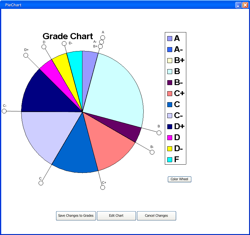
Figure 2.5.2.1
Figure 2.5.2.1 shows the pie chart being edited. After the user
clicks the save changes button the changes made to the pie chart will
update the histogram and the main student spreadsheet.
As in the Histogram the professor can also prevent a student from
recieving a certain grade. Like the histogram the professor can make it
so his students do not recieve a D. He could make them all receive a C.
To start the professor must drag the C pieline and drop it on top of
the C- pieline. If the user tries to drag the pieline past another
pieline it simply snap to the pieline closest to the one being dragged.
Also for instance if there is only one student recieving a C grade and
the professor drags the C+ grade and drops it in the middle of the
pieslice, the pieline will snap to the nearest possible percent. If the
user drops it closer to the C+ gradeline closer to the C pieline it
will snap on to the C pieline. If the user drops it closer to its
previous position it will snap back allowing that one student to
receive the C. Figure 2.5.2.2 below shows The professor dragging the C
pieline to the C- pieline.
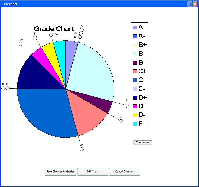
Figure 2.5.2.2
Next the professor drags the C pieline to the D+ pieline. This will
make the C- pieline move to the D+ pieline also. Figure 2.5.2.3 below shows
this.
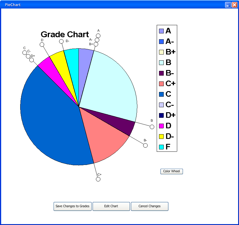
Figure 2.5.2.3
The professor then moves the C pieline again to the D pieline. This
will drag the C-, and the D+ pieline to the D pieline. This effectivly
makes all the students that were receiving a D to have a the grade C.
Below Figure 2.5.2.4 shows all four pielines stacked on top of each other.
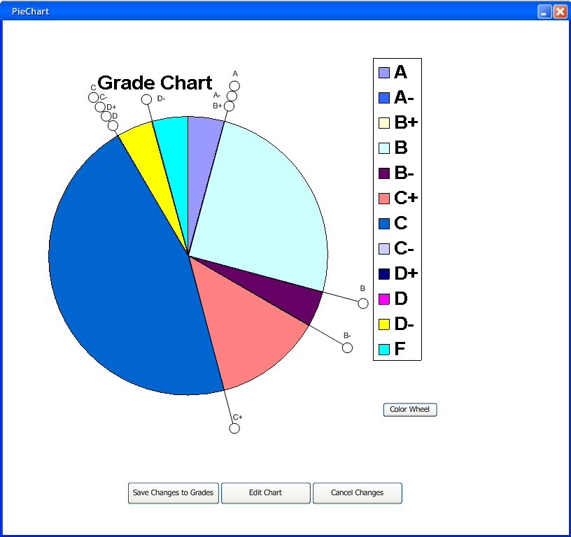
Figure 2.5.2.4
When the save changes button is pressed it updates both the gradesheet and the Histogram as well as the piechart. Below in Figure 2.5.2.5 shows all three updated.

Figure 2.5.2.5
Prev: Changing
the curve using the Histogram | Next: Teacher History |
Up: Graphs | Top: index