2.5 Creating a Visualization
This introductory scenario shows the menus and features in the Visualization tab window.
To create a histogram, first the instructor selects the Visualization tab and then a new window displays how to create visualization as shown in Figure 2.5.10
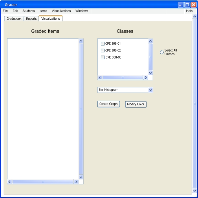
FIGURE 2.5.10
This is the information the user looks at when the user clicks the Visualizations tab. The user has a window with all the classes that are open. The select all radio button will select all the users classes.
This pull down menu shows the user the type of classes that can be displayed by the program. This dialog is shown by figure 2.5.11. The user has three choices; Histogram, Pie Chart, and Dot Plot.
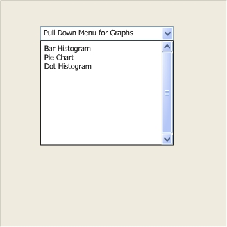
FIGURE 2.5.11
The modify color button opens up the grade scale which will allow the user to modify the color for each mark as shown in figure 2.5.12
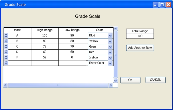
FIGURE 2.5.12
Prev: Add a Graded Item | Next: 2.5.1 Create a Histogram| Up: Functional | Top: Index