2.4. Adding Components
The Component Toolbar is made up of the most commonly used components that go into the creation of a prototype. The Component Toolbar allows you to quickly and effeciently design a user interface without having to individually create all of the components and buttons. To make the Component Toolbar visible the user must go to the 'Tools' menu and then choose 'Component Toolbar'. The Component Toolbar is visible in Figure 10 below.

Figure 10: Component Toolbar
2.4.1 Walkthrough of Component Toolbar
The two buttons located at the top of the component toolbar above the horizontal line are not actually used to create component objects. They are the Arrow Tool and the Show/Hide button.
The 'Arrow Tool' button will be used in order to allow the user to switch from using a component creation tool such as Text Box or Image to an arrow that can be used to point at and select objects located in the workspace area.
The 'Show/Hide' button is provided to allow the user to hide all of the component objects in the workarea from view so that the remaining drawing objects can be worked on without the clutter of the component objects getting in the way. After the work on the drawing objects has been completed then the user should click the 'Show/Hide' button again in order to make all of the component objects visible again. If the user chooses to use one of the component tools while the component objects are hidden, then the component objects will all become visible again at the same time as the button is released.
The rest of the buttons below the horizontal line are tools used for adding pre-built components to the prototype. These tools include Frame, Text Box, Menu, Menu Bar, Image, Check Box, Vertical Scroll Bar, Horizontal Scroll Bar, Radio Button and Button. A tool labeled 'More Components...' is also included to allow users to insert custom built components that were created with the Sensitize tool. (see Section 2.7)
Clicking the 'Frame' button will cause a new window to be created in the work area. These windows which make up a prototype are referred to as forms if they contain more than one active component. A prototype may have from as little as one form to as many as the user desires. The first form that the user creates will be the default form that is loaded upon execution of the prototype. A form is a container class, and all other data types must exist within a frame. A frame does not exist within an other datatype. For example a form can contain several other components such as text boxes and menu's, but no text box component may contain a form.
The 'Text Box' button causes the mouse pointer to be changed to a + when in the work area. The user then uses two mouse clicks to define a text box within a form. The details for how the box is drawn are laid forth in Section 2.3 in the 'Box' area. The text box is both an input and an output device. A default message can be displayed in the text box, and the program can also accept input from the user through the text box. Text can even be output to a text box after some action by the user. The only other object that can be added inside a text box is a scroll bar.
The 'Menu Bar' is an object that goes within a form that provies an area for menu's to be organized together. Clicking the 'Menu Bar' button will change the mouse cursor to a +, and then the same rules for defining a Box will apply to defining the limits for a Menu Bar. A Menu Bar object is allowed to contain one other kind of class only, and that is objects of type Menu. After the location on the screen for the Menu Bar has been established then the Menu Editor will appear. Details on using the Menu Editor can be found in Section 2.2.
The 'Menu' button simply loads the Menu Editor and allows you to add a menu or change the contents of a menu. See 'Menu Bar' or Section 2.2 for more details.
The 'Image' button is used to put a picture into a form. Choosing the Image tool causes the mouse pointer to be changed to a + when in the work area. Using the rules for drawing a box, the user defines with the mouse where on the form the picture will be. After the borders of the picture have been defined then a window with a file chooser and a preview window is displayed that allows the user to browse to the picture file desired. This causes a picture to be displayed in the form. All common formats of picture files will be allowed, including but not limited to .jpg, .gif, .tif and .bmp.
The 'Check Box' button will provide the user with a small (approx 1/8" X 1/8") box shaped mouse pointer when in the work area. This is the size and shape of the check box. The user should position the box shaped cursor where the check box is desired and click the mouse button. This will place a check box in the desired location and then automatically put a text box immediately to the right of the textbox. The user will then type in the caption for the check box in the text box. The text box is linked to the check box so that if one is moved at a later time, then they are both moved together. The user is allowed to leave the text box empty if so desired.
The 'Vertical and Horizontal Scroll Bar' buttons can be added to either forms, images, or text boxes. They will allow viewing of an object that is bigger than the space assigned to it. A Scroll Bar is the lowest level of object, and no other kind of objects can be added to it.
The 'Radio Button' tool will provide the user with a small (approx 1/8" radius) circle shaped mouse pointer when the cursor is located in the work area. This is the size and shape of the radio button. The user will click the mouse for each radio button that they wish to insert. Next to each radio button will appear a text box where the user can type in a caption for the associated radio button. The idea of a radio button is that only one of the N radio buttons can be selected at one time. Grouping will be arranged by each press of the Radio Button tool on the Component Toolbar. That is after the 'Radio Button' is pressed, the user will use the mouse to put several radio buttons on the form. This will be one set or group of buttons. Then to make another group the user will click the Radio Button tool on the toolbar a second time. Now all of the radio buttons created will belong to the second group of buttons.
The 'Button' option on the Component Toolbar is used to create standard rectangular buttons. When the Button tool is selected the mouse cursor will change to a + when moved into the workarea. All of the rules for drawing a box (described above) will apply to drawing the outline of the button. Then the button will appear and the user will have to type a caption for the button.
The 'More Components...' tool is provided to allow users to use previously saved drawing objects that have been sensitized to act as components. See Section 2.7 for more information on sensitization. The More Components button will bring up a window with a file chooser that will allow the user to choose a previously saved sensitized object. The sensitized object will then appear in the center of the currently selected form, and the user will locate the object in the desired position with the mouse.
2.4.2 Examples of Using the Component Toolbar
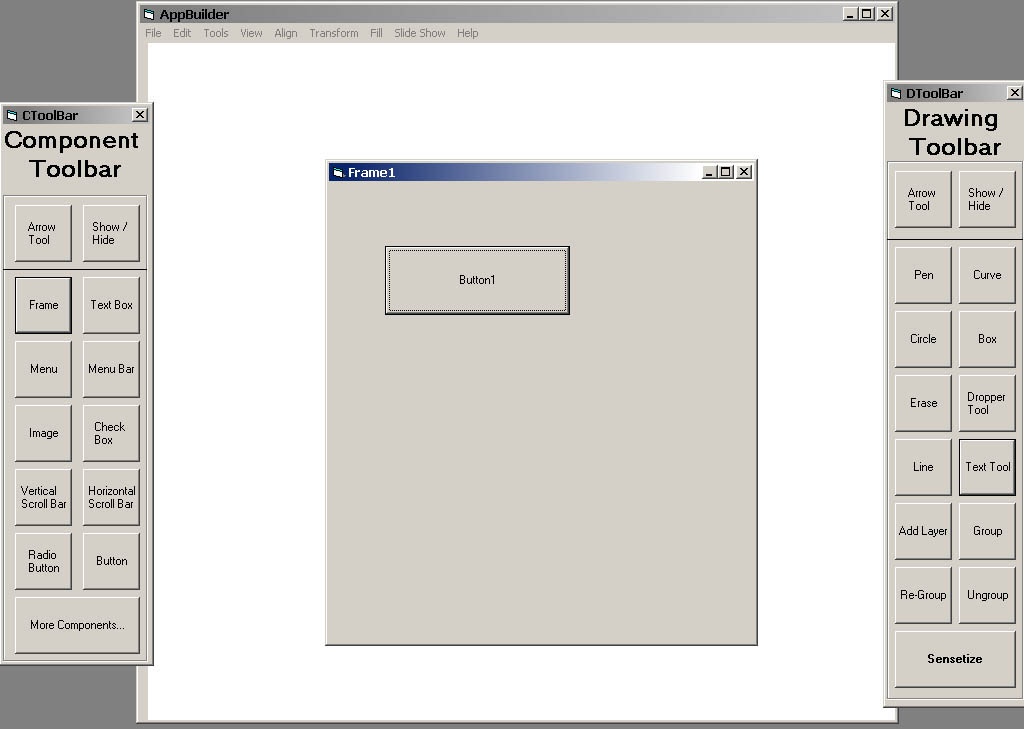
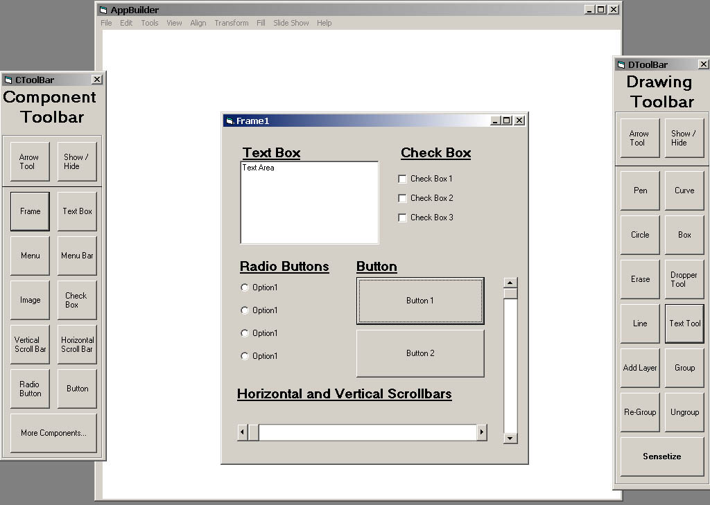
The following pictures illistruate frames that have been created by using only the component toolbar. There are no drawing objects in either of the frames. Figure 11 below showes only an empty frame with a single button in it, and then Figure 12 shows a complete frame that has multiple component objects located within it.

Figure 11: Frame with one button in it.

Figure 12: Frame with every different kind of component object except for menus and images.
These words and images are property of James C. Irwin, jcirwin@calpoly.edu
05/20/2002


