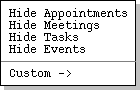
When the user selects the `Filter ->' item in the View menu,
the system displays the submenu shown in Figure 45.
Figure 45: Filter submenu.
Consider for example the month view shown earlier in
Figure 21.
If the user selects `Filter Hide Appointments' in the context of that
view, the system updates the display as shown in Figure 46.
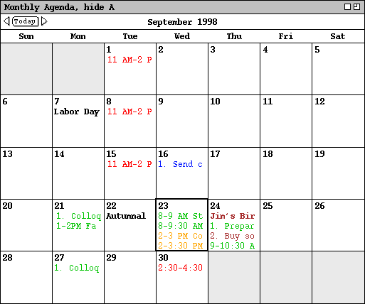
Figure 46: Month view with appointments filtered out.

Figure 47: Month view with meetings filtered out.
Having hidden appointments and meetings, a subsequent invocation of the
`Filter' menu appears as shown in Figure 48.
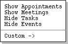
Figure 48: Filter menu in `Show Appointments', `Show Meetings' state.
Showing and hiding tasks and events is analogous to meetings and appointments.
At the day level and weekly table level, the separate areas of the display are
removed when tasks and/or events are hidden. For example, Figures 49 and 50
show the results of hiding both events and tasks in the context of the daily
and weekly views shown originally in Figures
14
and
18.
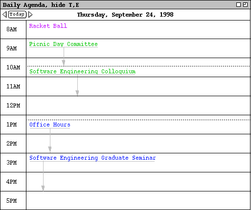
Figure 49: Events and tasks filtered out of a day view.
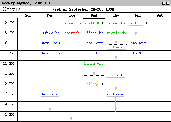
Figure 50: Events and tasks filtered out of a table-style week view.
Any or all of the commands can be in either the show or hide state. When all four commands are in the show state, all scheduled items are visible. When all four commands are in the hide state, no scheduled items are visible.
The four show/hide filtering commands apply only to calendar views at the item, day, week, and month levels. Show/hide does not apply to year-level views since there are no items visible at that level. At the item level of viewing, filtering applies to the entire item-level display window, not to individual fields within the window. Specific details of filter application at the item level are covered in Section 2.3.4.3.
Show/hide filtering does not apply to list views, since lists are already
specialized for each kind of item. The custom filters described in the next
section do apply to lists, as well as to calendar views. Operational details
of show/hide and custom filtering used in conjunction are covered in
Section 2.3.4.3.
2.3.4.1. Custom Filter Definition
The custom filtering feature of the Calendar Tool allows the user to define finer-grain filters than simply all items of a particular type. For example, the user can choose to filter out all but a particular category of item that is scheduled between some particular dates.
By default, there are no custom filters defined. Hence, when the user
initially selects the `View Filters Custom' menu item, the system
displays the submenu as shown in Figure 51.
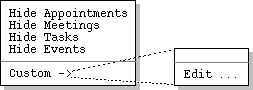
Figure 51: Initial custom filters menu.
To create a new custom filter, the user selects the `Edit ...'
command, whereupon the system displays the filter definition dialog shown in
Figure 52.
Figure 52: Filter definition dialog.
The `Filter Name' text box contains the name of the filter being defined. The initial default name is "New Filter". The user enters a chosen filter name by typing in the text box. The name for each defined filter must be unique among all other filters.
The editing fields below the filter name allow the user to define detailed filtering criteria for the display of items in calendars and lists. The criteria apply to all types of items that are currently visible, i.e., items for which the show state is on in the show/hide filter commands. The criteria apply uniformly to all calendar and list displays.
The fields in the filter definition constitute the union of components from all
four types of scheduled item. Given this, each field is not necessarily
applicable to all types of scheduled item. Table 6 defines specifically which
fields apply to which item types. (This table is a superset of
Table 5
defined for custom lists.)
| Data field | Applicable to these types of item |
| Title | all |
| Earliest Date | all |
| Latest Date | all |
| Earliest Time | appointments, meetings, tasks |
| Latest Time | appointments, meetings, tasks |
| Duration | appointments, meetings |
| Recurring? | appointments, meetings, tasks |
| Category | all |
| Location | appointments, meetings, events |
| Security | all |
| Priority | appointments, meetings |
| Task Priority | tasks |
| Completed | tasks |
| Earliest Completion Date | tasks |
| Latest Completion Date | tasks |
| Remind | appointments, meetings, tasks |
| Details | appointments, meetings, tasks |
| Attendees | meetings |
| Meeting State | meetings |
Table 6: Filter fields applicable to each type of scheduled
item.
There are a number of pulldown menus associated with the fields of the filter
definition. Figure 53 shows an the expansion of these menus.
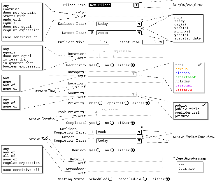
Figure 53: Expansion of filter definition menus.
The `Title' field in the filter definition defines which items are visible based on the value of their titles. Immediately to the right of the `Title' label is a text box containing a pattern string for item titles. The pattern is used in conjunction with the selection in the pulldown menu below the `Title' label. Specifically:
The last item in the `Title' field menu specifies the case sensitivity
of the pattern string matching. The menu item is an on/off toggle. By
default, case sensitive matching is on for `Title' matching.
2.3.4.1.2. Earliest and Latest Date
The `Earliest Date' and `Latest Date' fields define the earliest and latest scheduled dates for which items are visible. The small text box immediately to the right of the field label is used for a numeric value in the range 1 through 99. To the right of the numeric box is a combination text box and pulldown menu that is used to define the date range. Specifically:
The `Earliest Time' and `Latest Time' fields define the
earliest and latest scheduled times for which items are visible. For
appointments and meetings, the scheduled time is the start time; for tasks, the
scheduled time is the due time. Both fields contain time values. The default
values are 8 AM for earliest and 5 PM for latest. If the `Earliest
Time' field is empty, it is assumed to be 12:00 AM; if `Latest
Time' is empty, it is assumed to be 11:59 PM. If both fields are non-
empty, the earliest time must be less than or equal to the latest time.
2.3.4.1.4. Duration
The `Duration' field defines item visibility based on duration. A duration value is entered in hours and minutes in the two text edit boxes. If the user enters no duration value, the default is 1 hour and no minutes. The duration value is used in conjunction with a selection in the pulldown menu below the `Duration' label. Specifically:
The `Recurring?' field defines visibility based on whether a scheduled item is recurring. Specifically:
The `Category' field defines visibility based on the category of scheduled items. The pulldown menu to the right of the Category label allows the user to select one or more category values. A selected category is indicated with a check mark to the right of its name. The category-value selection is used in conjunction with the selection in the pulldown menu below the Category label. Specifically:
If exactly one category is checked in the right-side menu, then its color-coded
name appears in the text area. If two or more categories are checked, then the
name of the first category appears in the text area, suffixed with the string
"+ ...".
2.3.4.1.7. Location
The `Location' field is the same form of text box and menu combination
as the `Title' field. The entered pattern defines which items are
visible based on the value of their locations.
2.3.4.1.8. Security
The `Security' field defines visibility based on the security of scheduled items. The pulldown menu to the right of the field label allows the user to select one or more of the four security values. The security-value selection is used in conjunction with the selection in the pulldown menu below the label. Specifically:
The `Priority' field defines visibility based on the priority of scheduled items. Specifically:
The `Task Priority' field defines the visibility of tasks only, based
on their numeric priority. The small text box immediately to the right of the
field label is used for a numeric value in the range 0 through 10. To the
right of the text box are up- and down-pointing arrows that are used to
increment and decrement the numeric value. A value can also be typed directly
into the text box. The priority value is used in conjunction with the pulldown
menu below the `Task Priority' label. The items in the menu have the
same meanings as described above for the `Duration' field.
2.3.4.1.11. Completed? and Completion Dates
The `Completed?', `Earliest Completion Date', and `Latest
Completion Date' fields define the visibility of tasks based on if and
when tasks are completed. The `Completed?' field has the same three
alternatives as the `Recurring' field described above. The completion
date fields have the same text box and menu combinations as the `Earliest
Date' and `Latest Date' fields described above.
2.3.4.1.12. Remind?
The `Remind?' field defines visibility based on whether a scheduled
item has a reminder. The field has the same three alternatives as the
`Recurring?' field.
2.3.4.1.13. Details
The `Details' field is the same form of text box and menu combination
as the `Title' and `Location' fields. The entered pattern
defines which items are visible based on the value of their Details
field.
2.3.4.1.14. Attendees
The `Attendees' field defines the visibility of meetings based on their attendees lists. Immediately to the right of the `Attendees' label is a text box containing a pattern string. The pattern is in the form of a comma-separated list of calendar user IDs or a regular expression. The pattern is used in conjunction with the the selection in the pulldown menu below the `Attendees' label. Specifically:
The last item in the `Attendees' menu specifies case sensitivity in
the same manner as in the `Title' menu. The default for attendees
filtering is case sensitive off.
2.3.4.1.15. Meeting State
The `Meeting State' field defines the visibility of meetings based on
whether or not they have been accepted by the user. As described in
Section 2.4.1,
a scheduled meeting is one that the user has scheduled herself, or accepted
from another user. A penciled-in meeting is one scheduled by another user but
not yet accepted by a receiving user. If the `scheduled' radio is
selected, then only scheduled meetings are visible, i.e., not-yet-accepted
meetings are not visible. If `penciled-in' is selected, only meetings
not yet accepted by the user are visible. If `either' is selcted, all
meetings, both scheduled and not-yet-accepted, are visible.
2.3.4.2. Using Custom Filters
Figure 54 shows the result of the user having defined a filter named "Fall classes" with the following criteria:

Figure 54: Fall classes custom filter.
To complete the definition of this new filter, the user presses the `Add' button at the bottom of the custom filter dialog. In response, the system adds the filter to those that are available for use. To define additional new filters, the user types new names into the `Filter Name' text box, selects the desired settings, and presses the `Add' button for each new filter to be defined.
The names of available filters appear in two contexts:

Figure 55: Menu contexts in which filter names appear.
Consider again the example month view shown in Figure 21. Figure 56 shows the result of the user performing the following filtering commands:

Figure 56: Month view with Fall classes filter applied.
, hide hide-list , filter custom-filter-namewhere hide-list is a list of one-letter abbreviations indicating which of the four types of items is (are) hidden; custom-filter-name is the name of the active custom filter, if any. If no items are hidden, the hide-list (including the trailing comma) is missing. If no custom filter is active, the custom-filter-name (including the leading " , filter" prefix) is missing.
To clarify that a filter is active, its name is checked in the custom filter
menu. For example, Figure 57 shows the state of the filter menus as
established by the user at this point in the scenarios.

Figure 57: State of the filter menus with filtering applied.
When a filter is selected from the list, it is applied automatically to all
active display windows. For example, consider the appointments list shown
originally in
Figure 31.
Activating the "Fall classes" filter when this display is visible
causes the system to update its display to that shown Figure 58.

Figure 58: Appointments list with Fall classes filter applied.
Since the show/hide filtering commands do not apply to lists, the format of the banner string is different for a list display. Viz., the filtering banner for a list display contains only a custom filter name, with no hide-list.
The user can change or delete defined filters in the custom filter dialog. To
change an existing filter, the user selects the desired filter in the
`Filter Name' menu, or types its name in the text box and presses the
Enter key. The user then performs the desired changes and presses the
Change button. For example, Figure 59 shows the user having edited
the previously defined `Fall classes' filter.
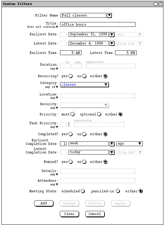
Figure 59: Changed years-events filter.
If the user applies this changed version of the `Fall classes' filter
in the context of
Figure 56,
the system updates the display as shown in Figure 60, where the appointments
with "Office hours" in the title have been filtered out.
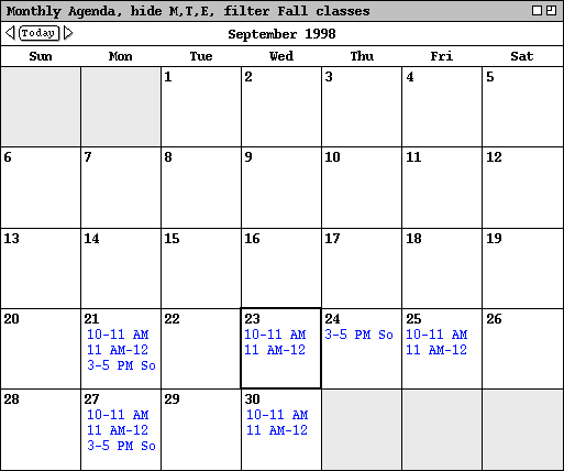
Figure 60: Changed Fall classes filter applied, filtering out office hours.
To delete an existing filter, the user selects its name from the `Filter Name' menu and presses the `Delete' button. In response, the system removes the filter from those that are defined, removes it from the `Filter Name' menu, and clears the `Filter Name' text box. If a deleted filter is applied at the time of its deletion, it is unapplied just prior to deletion.
The `Apply' button is used to apply the currently selected filter, as if its name had been chosen from `View Filters Custom' submenu. When the `Apply' button is pressed, its text changes to `Unapply' so a subsequent press will deactivate the filter. Hence the button acts as an apply/unapply toggle. The application of the `Apply/Unapply' button is fully linked to the selection of a filter by name from the `View Filters' submenu. Specifically, when `Apply' is executed, the filter name is checked in the menu; when `Unapply' is executed, the filter name is unchecked in the menu. Similarly, when a filter name is selected in the menu, the button label for that filter is changed to `Unapply'; when the filter is deselected from the menu, the button name is changed to `Apply'.
To clear all entered information in the custom filter dialog, the user presses the `Clear' button. In response, the system restores the dialog to the state it was in when it was most recently displayed on the screen. The `Cancel' button removes the custom filters dialog from the screen. Only the explicit selection of `Cancel' (or an environment-specific window closing button) removes the dialog from the screen. Execution of any of the other commands (`Add' through `Clear') leaves the dialog on the screen.
To deactivate a custom filter, the user reselects its name in the `View
Filters Custom' submenu. In response, the system restores all filtered
displays to their unfiltered states. In addition, the filter name is removed
from all display window banners and the filter name is unchecked in the
`View Filters Custom' submenu.
2.3.4.3. Details of Filter Application
As noted eariler, the four show/hide filter commands apply only to calendar
views, not to lists. Custom filters apply uniformly to calendar and list
views. When a filter is applied, it takes effect immediately in all applicable
display windows. The displays to which filtering applies are those generated
by the top nine commands in the `View' menu, as shown in Figure 61.

Figure 61: Commands affected by filter settings.
A custom filter is applied in conjunction with the current settings of the four show/hide filter commands. Specifically, the four show/hide commands are applied first, then any items remaining in the display are further filtered based on the definition of the currently active custom filter, if any. It is possible for a custom filter alone to filter out all items of a particular type, even if show/hide filtering is in the show state for that type of item. For example, if all meetings were defined to be of a particular category, then a custom filter that hides that category effectively hides all meetings.
For list views, a custom filter is applied in conjunction with the current settings of the list viewing options described in Section 2.7.4.1. Specifically, the list display is first configured per the option settings and then the custom filter is applied. In this way, a date range defined in a custom filter overrides any date range specified for a list particular list.
When a custom filter has the effect of filtering out all events and/or tasks in a daily or table-style weekly view, the event and/or task areas of the display are removed. This kind of filtering effect is illustrated in Figures 49 and 50. Again, a custom filter can have such an effect on its own, even if show/hide filtering for events and tasks is in the show state.
Only one custom filter can be active at any given time. The reason is to avoid the possibly conflicting effects of simultaneously applying two or more custom filters. When one custom filter is active, selecting another custom filter automatically deactivates the first filter, then activates the newly-selected filter.
As noted in Section 2.3.2.1, filtering affects the behavior of the `Next' and `Previous' view commands at the scheduled-item viewing level. Specifically, when filtering is active and the user executes a `View Next' or `View Previous' command, the system only displays items that are visible through the currently active filtering. For example, suppose the user has set filtering active as defined in Figure 57 above. In this filtering state, the `View Next' and `View Previous' commands display only items that meet the filtering criteria, i.e., appointments that match the `Fall classes' filter. Items that do not meet these filtering criteria are skipped in the next/previous traversal. When a filter specifies an earliest and/or latest date, the next/previous traversal ends at those dates. For example, with the `Fall classes' filter applied, the `Previous' traversal stops at September 21, 1998; the `Next' traversal stops at December 4, 1998.
When filtering is applied, all active item-level windows for the current
calendar are subject to filtering by making the windows invisible. For
example, if a task item window is active when the user executes `View Hide
Tasks', that window is removed from the screen. When the user
subsequently executes the `Show Tasks' command, the removed window is
restored to visibility in its original X,Y position on the screen. The front-
to-back position of restored windows is the same as it was at the time of
filter activation, relative to all windows that were active at the time of
filter activation the front-to-back positions of which did not change while
filtering was active. Restored windows are placed behind all windows made
newly visible or moved to the front during the time the filter is active.