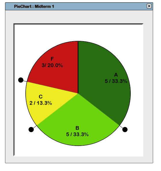
After selecting a data set to display, a PieChart window appears.
(In this example, the data set for "Midterm 1" was selected).
 |
| Figure 72: A Basic PieChart View |
The PieChart sections are representative of the relative number of people in each grade range.
Next to each section is a number for the number of students in that grade category and a percentage for what percentage of the class that group of students represents
Each Grade Line represents the separation between grades, or the grade cutoff. Users can click and drag these lines around the PieChart to adjust the grade cutoffs, so as to achieve a more desirable distribution of grades. The following shows the previous example with the Grade Line adjusted so that two people are included in the 'D' range of grades:
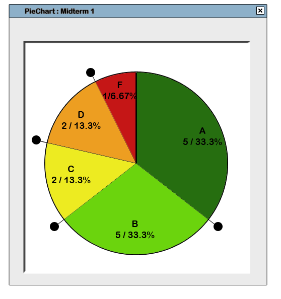 |
| Figure 73: Effect of Moving a Grade Line |
Notice the change in the number and percentage of students that fall into the 'D' and 'F' categories. Any changes made on this pie chart are also made on the gradesheet. The left-hand image is a section cutout of the gradesheet with the students' original scores, and the right-hand image has the students' new updated scores. Users have an option (to be later discussed in Custom Grade Scheme) which allows them to set the value that each grade represents. In this example, if a student receives an 'F', they keep whatever grade they have. If a student receives a 'D', the higher value of their grade and 65 (what a 'D' represents) is taken into calculation.
(Refer to Figure 62. Effect on GradeSheet)
Collapsing the Lines into Each Other
By clicking and dragging a line onto or over another Grade Line, the lines collapse into each other. Collapsed grades are shown aligned to the right of the grade that the section covers. The grades are aligned vertically with their tab.
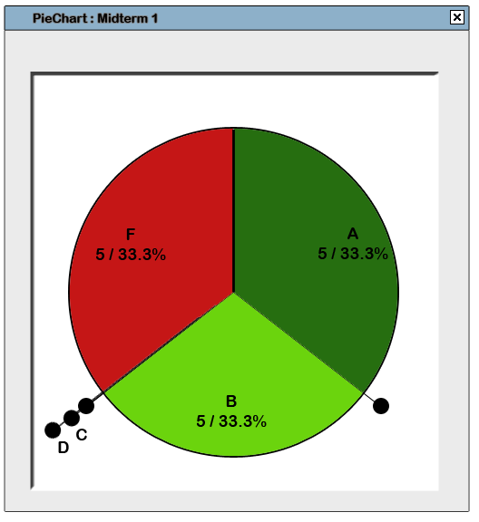 |
| Figure 74: Collapsing Lines (PieChart) |
Dragging Collapsed Lines
When the user clicks and drags the Grade Line, the line with all the collapsed grades moves around. This is the same as clicking and dragging the innermost (leftmost) Grade Line tab.
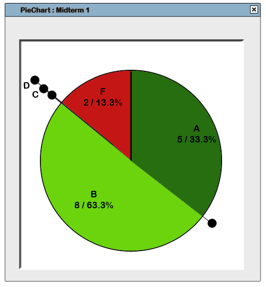 |
| Figure 75: Moving Collapsed Lines (PieChart) |
Dragging Collapsed Lines Out
Users can expand collapsed grades by clicking on the grade or its tab and dragging it out in the direction that the grade should fall in. In this case, since D is below both B and C, D can only be separated by dragging downwards. Likewise, since B is above both C and D, B can only be separated by dragging upwards. C can be dragged in either direction.
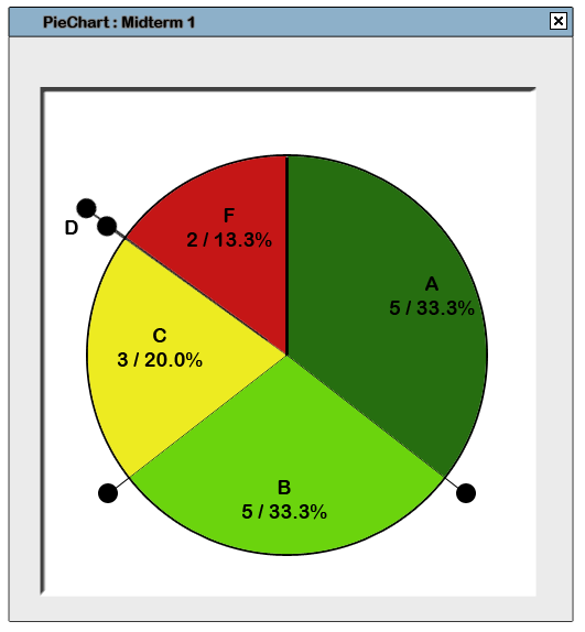 |
| Figure 76: Expanding Collapsed Lines (PieChart) |
Adding a Grade Line
Users may want to add +/- grades or other grades. They can do so by right-clicking a Grade Line, by which the following menu results:
(Refer to Figure 66. Grade Line Right-Click Menu)
Adjust Settings: By selecting this, a dialogue pops up that allows users to change the current settings for their graph.
Set as Default: Selecting this makes the settings applied to this line the default for adding new lines.
Selecting either 'Add grade above' or 'Add grade below' adds a grade to the left or right, respectively, of the current Grade Line and results in the following prompt:
(Refer to Figure 80. Adding a Grade Line)
The default values for a new Grade Line above or below the current Grade Line are + and - respectively. The value that the new region represents is half of the sections in between (explained in further detail in the Custom Grade Scheme section). So, in the case of this example, adding a new Grade Line above 'B' (value 85) and below 'A' (95) results in a new grade with default symbol being 'B+' and default value being 90.
The result of performing the actions stated above are shown below.
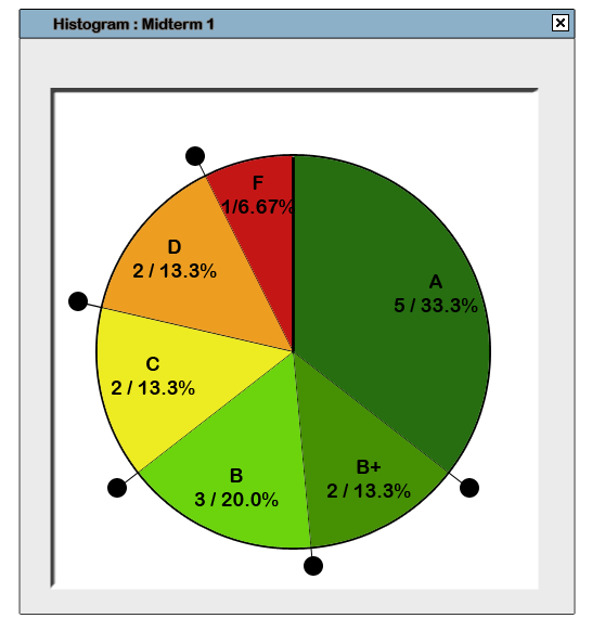 |
| Figure 77: PieChart with B+ |
Removing a Grade Line
A user right-clicks on the Grade Line they wish to remove and selects the 'Delete Grade Line' option in the menu that appears:
(Refer to Figure 66. Grade Line Right-Click Menu)
Doing so results in the following prompt to clarify that the user wishes to remove a Grade Line.
(Refer to Figure 68. Grade Line Removal Prompt)
GoTo: