Specification Change Orders
for the Prototyping Tool
Refinement of Scripting API (26sep05)
The file
../requirements/idraw-interface.h
is a C/C++ scripting API for the drawing commands. It was done for the idraw
predecessor of jdraw, but it looks pretty decent. So, this .h file can be used
as the basis of a refined API for the Jdraw/ProtoJ scripting methods.
Script Editor Revisions (gfisher, 2mar04)
Add `Save Tab', `Save All', and Delete Tab' buttons
to the script editor and change the behavior of the editor accordingly. This
means that an explicit user button press is required to save and delete
scripts, instead of the more implicit way it's defined in the "Refining
Scripting" section
below.
Misc Behaviors (10jul03)
Movement of any drawing or component off canvas is not possible, i.e., the
movement stops at the boundary of the canvas. This is precisely the behavior
of the original idraw.
Remove color chooser icon from both toolbars.
In general, commands use the "no effect" methodology instead of the "disabled
interface" methodology when the precondition of a command is not satisfied.
E.g., for the align commands, the menu items are never disabled (i.e., never
greyed out), but simply have no effect when two or more items are not selected
on the screen. See the
Disabling and Enabling Interface Elements
in the rolodex tool requirements for further discussion.
The following are clarifications to the behavior of keys in a the menu editor:
-
All printable characters are considered part of the menu or menu item name.
-
All non-printable chars except newline, tab, and delete are disabled.
-
Delete works in the normal way.
-
Newline defines the end of a menu or item.
-
Tab is only enabled at the beginning of a line; further, only N+1 tabs can be
entered on a given line, where N is the number of tabs on the preceding line.
The precise definition for the spacing on the vertical guide lines is four
en for current font size of the menu editor. Given this, the current
implementation of the menu editor as a JTabel is wrong, since it does not allow
overlapping columns. A suggested implementation is as a JLayeredPane, with a
JextArea on the button layer and transparent-background JPanel with Graphics2D
vertical lines as the upper layer. SetOpaque false on the JPanel, and
SetForeground to light grey for the vertical lines.
As has been mentioned elsewhere, but to reiterate, the scripting language needs
to be fully refined, in particular the parameters on all static methods need to
be fully reconciled with the corresponding GUI dialogs. This is Fisher's major
TODO item for the summer (which as of September 25 he did not do, which means
he'll probably task one of the new SP students to do it).
The Script Editor dialog needs OK and Cancel buttons.
New Menubar, Menus, and Toolbars (gfisher, 19mar03)
The following is the new menu structure for the prototyping tool:
File Edit Tools Structure Style View Help
Here is an expansion of the menus:
File:
  New
  Open ...
  Import ...
  Revert
  Close
  Close All
  ---------------
  Save
  Save As ...
  Save All
  ---------------
  Generate ...
  ---------------
  Print ...
  ---------------
  Exit
|
Edit:
  Undo
  Redo
  Repeat ...
  ---------------
  Cut
  Copy
  Paste
  Duplicate
  Delete
  Select All
  ---------------
  Find ...
  Spell check ...
  ---------------
  Command ...
  ---------------
  Preferences ...
  ---------------
  Mode ->
    Edit
    Run
|
Tools:
  Drawing Toolbar
  Component Toolbar
  Property Editor
  Script Editor
  Slide Show
  Explorer
|
Structure:
  Group
  Ungroup
  Regroup
  ---------------
  Flip Horizontal
  Flip Vertical
  Rotate 90 Clockwise
  Rotate 90 CounterCW
  ---------------
  Transform ->
    Precise Move ...
    Precise Stretch ...
    Precise Scale ...
    Precise Rotate ...
    Precise Reshape ...
  Arrange ->
    Bring to Front
    Bring Forward
    Send Back
    Send to Back
  Align ->
    Left Sides
    Right Sides
    Bottoms
    Tops
    Vertical Centers
    Horizontal Centers
    Centers
    Left to Right
    Right to Left
    Bottom to Top
    Top to Bottom
    Align to Grid
  ---------------
  Number of Drawings
  Number of Components
|
Style:
  Font ...
  Text Size ->
  Text Style ->
  ---------------
  Brush ->
    None
    -------
    <------
    ------>
    <----->
    - - - -
    -  -  -
    =======
    ---------------
    Color ...
    Edit ...
  Fill ->
    None
    white
    horz lines
    vert lines
    right diag
    left diag
    black
    ---------------
    Color ...
    Edit ...
|
View:
  Zoom In
  Zoom Out
  Normal Size
  Center Page
  Home
  ---------------
  Gridding On[Off]
  Show/Hide Grid Lines
  Grad Spacing ...
  ---------------
  [Show]Hide Drawing
  [Show]Hide Components
  [Show]Hide Text
  [Show]Hide Selection
  Show All
  ---------------
  [Un]Highlight Hidden
  [Un]Highlight Grouping
  [Un]Highlight Boxes
  ---------------
  Layers ...
  Page ...
  ---------------
  Windows ->
|
Here are updated tool bars:
Components:
  Select
  Menubar
  Button
  Text
  Slider
  List
  Table
  Box
  Pane
  Frame
  Scroll Bar
  More Components:
    Tree
    ColorChooser
    FileChooser
    user defined ...
| Drawing:
  Select
  Move
  Stretch
  Scale
  Rotate
  Reshape
  Text
  Line
  MultiLine
  Curve
  Ellipse
  Rectangle
  Polygon
  Shape
  Image
|
The new menus are a combination of the current jdraw menus, the menus in the
current prototyper requirements, plus some additional new commands. Note that
some new "..." suffixes have been added to some of the items that did
not have them before. Also some new item separators have been added. I'll do
a full revision of the menu descriptions in Section 2.1 of the prototyper
requirements. In the meantime, here's a summary of the changes reflected in
the above new menu structure:
-
The new `File' menu is a combination of jdraw and prototyper, plus new
items. All of the prototyper items are there, with `Make Prototype'
changed to `Generate ...'. `Revert', `Import ...',
and `Print ...' are from jdraw. `Close All' and `Save
All' are new. They apply to all open canvases, whereas `Close'
and `Save' apply only to the current canvas.
-
The new `Edit' menu is also a combination of jdraw and prototyper,
plus new items. `Duplicate' comes from jdraw, and `Find ...'
comes from the prototyper. `Spell Check ...' is new; it opens a
standard spell check dialog that goes through all of the text in all components
and drawings. The commands at the bottom of the current jdraw menu, starting
with `Flip Horizontal', have all been moved to the new
`Structure' menu. The new Edit->Command ...' item opens a
simple BeanShell editor where the user can type in a scripting command. The
`Preferences ...' item opens a simple preferences editing window which
we can discuss at some later point. I'm thinking that it can just be a very
simple text-style properties editor, perhaps XML-based. The
`Edit->Mode' command at the end was moved from the current prototyper
`Tools' menu.
-
The `Tools' menu is mostly from the current prototyper, with a few
modifications. The `Menu Editor' is changed to a more general
`Property Editor'. The way it works is to display a property editor
for the currently selected drawing or component. If the currently selected
component is a menu bar or menu, the property editor is a menu editor. There
are other specific property editors for other components, which will be simpler
versions of the property editors in netbeans. I'll do details of these soon.
The ``Slide Show' item is new in the `Tools' menu; it opens a
dialog that has the same commands as are as in the current `Slide
Show' menu, but laid out in a dialog. We'll work out the details soon.
The `Navigator' item in the current `Tools' menu is changed
to `Explorer' in the new menu. Finally, the `Mode' item in
the current prototyper `Tools' menu has been moved to the new
`Edit' menu.
-
The new `Structure' menu comes from the current `Structure'
Edit', and `Align' menus in jdraw, and the `View',
`Transform', and `Align' menus in the prototyper.
`Group' and `Ungroup' are from jdraw. They apply only to
graphics; the Box component is the equivalent of a group for
components. The `Regroup' command is new; it allows the user to run
`Ungroup', change one or more elements of the group, then put them
back together in the original group. Conceptually, `Regroup'
undoes the most recent `Ungroup' command, even if there were
edits or deletions made in between `Regroup' and `Ungroup'.
The four `Flip' and `Rotate 90' commands were formerly in the
jdraw `Edit' menu. The `Transform' commands are moved from
the jdraw `Edit' menu and the prototyper `Transform' menu.
The `Arrange' commands are moved from the jdraw `Structure'
menu and `Transform->Arrange' prototyper menu. The `Align'
commands are the same as in the current jdraw and prototyper, but they're moved
from a top-level menu to a second-level pull-right menu. The `Number of
Graphics' command is from jdraw, and `Number of Components' does
the same thing for components in the prototyper.
-
The new `Style' menu has items from the current jdraw `Text',
`Brush', and `Pattern' menus, and the current prototyper
`Fill' menu, with some significant reformatting. A `Text'
menu was missing from the prototyper, but should have been there. The first
three items in the new `Style' menu are from jdraw `Text',
with reformatting. Specifically, the inline font-size and text-style items in
the current jdraw menu have been put into pull-right menus instead. The
`Style->Brush' and `Style->Fill' are the current jdraw
`Brush' and `Pattern' menus. They supersede what's in the
current prototyper `Fill' menu.
-
The new `View' menu has items from the jdraw `Options' menu
and the prototyper `View' menu. `Zoom In' and `Zoom
Out' are called `Reduce' and `Enlarge' in the jdraw
`Options' menu. `Normal Size' is from jdraw
`Options'. `Center Page' is new; it puts the current page in
the center of the canvas (see below for more on paging). `Home' is
from jdraw; it scrolls the drawing canvas to the upper left corner, so that the
vertical scrollbar (if present) is all the way at the top and the horizontal
scrollbar is all the way to the left. The `Hide Drawing' and
`Hide Components' commands are show/hide toggles that do the same
thing as the `Show/Hide' buttons in the toolbars; they've been moved
off the toolbars into the menus. `Hide Text' is new; it's a show/hide
toggle for all text graphics, and all text inside components, such as button
names and label text. `Show Grouping' is also new; it puts a light
grey rectangle around all groups, including nested groups. The `Layers
...' and `Page ...' commands are from the jdraw
`Options' menu. The `Windows ->' pull right menu has a list
of all open canvas windows. (Plus see below for more about how it's different
in the prototyper versus jdraw).
An important feature of the new menu layout is that the menus for the
prototyping tool are a proper superset of the jdraw menus. Here are the
specific differences between the prototyper versus jdraw menus:
-
There is no `File->Generate ...' command in jdraw (and the menu
separator above it is not there).
-
There is no `Edit->Mode' command in jdraw (and the menu separator
above it is not there).
-
There is no `Structure->Components' command in jdraw.
-
There is no `View->Hide Components' command in jdraw.
-
There is no `Tools' menu in jdraw.
-
The first item in the `View->Windows' menu in jdraw is
`Toolbar', followed by a separator. This is a checkbox menu item that
has the same use as the `Drawing Toolbar' item in the `Tools'
menu of the prototyper. Since jdraw has no `Tools' menu, the
show/hide menu item for it goes in the `View->Windows' menu.
What this means is that the prototyper acts like a "plug in" to jdraw, the way
we discussed in our last meeting.
The new Components toolbar has been reorganized, based largely on a
careful analysis of what is provided in the NetBeans GUI builder. A detailed
comparison of this toolbar and what netbeans provides is in a
separate document.
The new Drawing toolbar is an integration of the current jdraw and
prototyper toolbars.
Clarification of Drawing and Component Interaction (gfisher, 19mar03)
When any drawing initiates within an internal frame, it is constrained to stay
within that internal frame. This form of constrained drawing works the same as
drawing outside the boundary of a jdraw canvas works now. Namely, when the
user drags the mouse outside of the internal frame boundary, the drawing
continues, but it cannot be seen outside of the constrained area. If the user
leaves the mouse button down while dragging outside but then moves back inside,
the drawing continues where it left off. An internal frame should have scroll
bars added when a drawn objects goes beyond its boundaries, in the same way
that canvas scrollbars work.
When the user performs lassoing, it applies separately to drawing objects and
components. Specifically, the lassoing behavior is based on which arrow tool
the user has chosen, the one in the drawing tools or the one in the component
tools. When lassoing graphics, components are ignored, and vice versa. When
the user clicks on a graphic or component, it automatically chooses the arrow
tool in the appropriate toolbar. This means that when the user starts
lassoing, either graphics or components will be active.
Some Code Generation Ideas (gfisher, 19mar03)
Here are some basic ideas on how Java code generation can work.
-
When an align command and group command are followed in immediate succession on
a set of components, this successive pair of commands has a special effect.
Namely, it places the components in a horizontal or vertical box, with the
appropriate alignment.
-
All of the drawing objects are collected into a single jpeg image and placed in
the background of the generated GUI. Any boxes created by align/group command
pairs are turned into javax.swing.Boxes.
-
The page layout information in the drawing editor is totally ignored during
code generation. This page information is strictly for formatting on a
printer.
New name for the Prototyping Tool (gfisher, 19mar03)
How about "ProtoJ" as the name for the prototyping tool?
Drawing and Component Property Editing (gfisher, 3mar03)
Section 2.5.2 of the requirements provides a very brief description of property
editing. In that description, the Property Editor is invoked via the component
navigator. In the new command menus, the Property Editor can also be invoked
from the Tools menu. This section of the SCOs provides additional details
about the function of the Property Editor.
There is a separate property editor window for each different type of
component, as well as one for all graphics. To bring up a property editor, the
user selects an item on the canvas, and then selects `Tools->Property
Editor'. In response, the system displays a property editor for the
selected item, of the general form shown in 1.
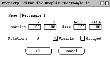
Figure 1: Revised Property Editor.
This is a revised version of the property editor shown in
Figure 14
in Section 2.5.2 of the original requirements. When the user selects a
different item on the canvas and there is already a property editor displayed
for that type of item, then the values in the displayed property editor change
to the values of the newly selected item. When the user selects a type of
canvas item for which no property editor is currently displayed, then the user
must select `Tools->Property Editor' again in order to make an editor
for the selected type of item appear.
The property editor shown in
Figure 1
is common to all graphics. Most of the same information for a graphic also
appears at the top of the property editor for components, except the
`Rotation' field is replaced with an `Enabled' radio button,
and the `Grouped' checkbox is missing. For example, Figure 2 is the
property editor for a button.
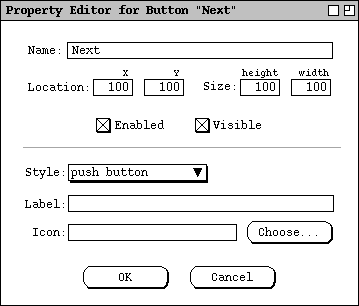
Figure 2: Button property editor.
The default for `Enabled' is on. When it's off, the component is
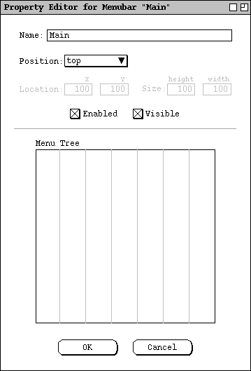
greyed out and not enabled in run mode. The property editors for menubar,
menu, and menu item are special cases that may not have x/y coordinates or
size. For the menubar, there is a `Position' combobox, with
selections top, bottom, left, right and free. If any but `free' is
selected, the `Location' and `Size' fields are disabled. For
menu, there is a `Position' combobox with integer selections from 1 to
the number of items in the parent menubar, and a last selection of `pop-
up'. If any but `pop-up' is selected, the `Location'
and `Size' fields are disabled. For menu item, there is a
`Position' combobox with integer selections from 1 to the number of
items in the parent menu.
Additional, type-specific properties appear in the bottom part of each
component property editor, separated with a horizontal rule. The following
table defines the properties specific to each type of component:
| Component
| Properties
| Notes
|
| Menubar
|
Menubar tree editor
|
The menu tree editor is the one shown in
Figure 4
in Section 2.2 of the current requirements. Since the menu editor is now part
of a property editor, it won't have the other buttons that are shown in the
current requirements in Section 2.2. Otherwise, it will work the way it's
described in 2.2. Here is a picture:
|
| Menu
|
Label, Icon, Menu tree editor
|
The tree editor is the same as that which appears in the menubar editor for the
selected pulldown menu. The Label text can be edited by typing in the menu
editor. The Icon is is the name of a jpeg or gif file, that can be browsed
for.
|
| Menu item
|
Style, Label, Icon
|
Style is one of Plain Item, Checkbox Item, Radio Button Item, or Separator.
The Label text can be edited by typing in the menu editor. The Icon is is the
name of a jpeg or gif file, that can be browsed for.
|
| Button
|
Style, Label, Icon
|
Style is one of Push Button, Radio Button, or Check Box. The Label text can be
edited by typing directly in the button, or in the property editor.
|
| Text
|
Style, Rows, columns, editable.
|
Style is one of Single-Line or Multi-Line. When Single-Line is selected, Rows
is disabled. For multi-line text, scrollbars appear when the height and width
settings too small to allow all rows and columns to be visible. For
single-line text, scrollbars never appear.
|
| Slider
|
Style
|
Style is one of Horizontal, Vertical, Progress Bar, Spinner
|
| List
|
Rows, editable.
|
|
| Table
|
Rows, columns, editable.
|
|
| Box
|
Orientation, Margins, New Spacer Size.
|
Orientation is one of horizontal or vertical. Margins are top, bottom, left
and right. New spacer size is the size of the spacer inserted when a new
component is added to the box. Margins are physically rendered as Spacer
components.
When a component is moved anywhere within a box, it is snapped into position
next to or between the two nearest components. [Need to work out details of
where new spacer goes, based on whether new component is added to left (top),
mid, or right (bottom) of box.] The binding of components in a box is "loose"
in that all components can be individually selected and moved. If component
movement remains within the box, the moved component is resnapped to a new
position within the box when the move is done. When a component is resized
within a box, its neighboring component(s) and the box itself are resized
dynamically along with component being resized. When the user moves a box by
selecting its border, all of its components move along with it.
|
| Spacer
|
Orientation
|
Orientation is one of horizontal or vertical. Spacers can appear only within
boxes. Spacers cannot be individually moved, only resized, which can be done
graphically or using a property editor. When a spacer is set to size zero, it
shows up as a very small grey spacer icon, which can be difficult to grab.
Therefore, the easier way to set the size of a zero-size spacer is to select it
(via lasso) and bring up its property editor.
|
| Pane
|
Style
|
Style is one of tabbed, split, layered, option.
|
| Frame
|
Style
|
Style is one of External or Internal. When there are one or more external
frames on a canvas, the canvas itself is considered a desktop. When there are
no external frames in a canvas, the canvas is considered a frame. External
frames can only be placed directly on the canvas, not inside other components.
Internal frames can be placed anywhere in a single-frame canvas, or within
other external or internal frames.
|
Refining Scripting
To view the script editor for a component, the user selects that component and
then selects `Tools->Script Editor'. In response, the system displays
a script editing dialog of the form shown in Figure 3.
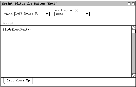
Figure 3: Refined script editor.
The banner in the script editor window includes the type and name of the
selected component. The `Event' combobox selects the event type to
which a script applies. The default is `Left Mouse Up'. The event
types are these:
Left Mouse Up
Left Mouse Down
Middle Mouse Up
Middle Mouse Down
Right Mouse Up
Right Mouse Down
Left Double Click
Mouse Enter
Mouse Leave
Key Press
This is the order in which they appear in the pulldown part of the
`Event' combobox.
The `auxiliary key(s):' combobox is a checklist of keys that are
pressed in conjunction with a selected mouse event to trigger a script. The
available auxiliary keys are these:
| Key
| Abbreviation
|
| Shift
| Shf
|
| Control
| Ctl
|
| Alt
| Alt
|
There is also a `none' selection at the top of the auxiliary keys
list; `none' is the default selection. If the selected event is
`Key Press', then the `auxiliary key(s):' combobox is
replaced with a text field, as described
below.
The body of a component script is a segment of executable Java code. The
script may access all of the built-in prototyping classes and methods. Typical
accesses are to static scripting methods, such as "SlideShow.Next" as
shown in Figure 3. The scope of a script code segment is that of a method body
within the component instance to which the script is attached. The method
itself is anonymous, since no method header or begin/end curly braces appear in
the script editor. Within the script scope, the normal Java identifier
"this" refers to the instance of the scripted component. Further
details of scripting classes and methods are covered in Section ???.
A component has a separate script for each type of event. Tabs along on the
bottom of the script editor provide convenient access to multiple scripts. For
example, Figure 4 shows an editor with scripts defined for `Left Mouse
Up' and `Mouse Enter'.
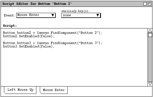
Figure 4: Script editor with two scripts defined.
The relative left-to-right order of the tabs is the same as the top-to-bottom
order in the `Event' combobox.
Each distinct configuration of mouse event and auxiliary key(s) defines a
separate event, which is separately scriptable. For example, Figure 5 shows
the user having defined a script for the event `Left Mouse Up with
Shift', in addition to the script for `Left Mouse Up' with no
auxiliary key.
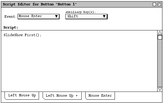
Figure 5: Scripts for both `Left Mouse Up' and `Left Mouse Up
with Shift'.
When multiple auxiliary keys are selected, the entry in the `auxiliary
keys' combobox is an abbreviated string of the form "kkk+..",
where "kkk" is a three character abbreviation for an auxiliary key.
For example, Figure 6 shows the user selecting both `Shift' and
`Control' auxiliary keys.
To appear.
Figure 6: Selecting both Shift and Control auxiliary keys.
Figure 7 shows the resulting display of the combobox.
To appear.
Figure 7: Auxiliary key abbreviation for Shift+Control
auxiliary keys.
When only a single auxiliary key is selected, its full (unabbreviated) name
appears in the combobox, as shown in
Figure ,
for example.
The tabs for auxiliary-keyed mouse events are suffixed with a plus sign. If
scripts are defined for the same mouse event with two or more different
auxiliary key configurations, the tab labels for all such scripts are the same.
For example, Figure 8 shows the tab configuration when scripts are defined for
`Left Mouse Up', `Left Mouse Up with Shift', and `Left
Mouse Up with Control'.
To appear.
Figure 8: Scripts for three different `Left Mouse Up' events.
The user can distinguish which auxiliary key(s) are selected for a particular
script by selecting that script's tab and looking in the `auxiliary
keys' combobox. Multiple tabs for the same mouse event are sorted left to
right in the following relative order:
-
no auxiliary keys
-
+Shf
-
+Ctl
-
+Alt
-
+Shf+Ctl
-
+Shf+Alt
-
+Shf+Ctl+Alt
-
Ctl+Alt
A new script tab is created when the user performs the following actions:
-
selects an item in the `Event' combobox and a configuration of
auxiliary keys for which no script has yet been defined
-
enters the first character of text in the Script text
area.
If the user deletes all text from the script text area and changes to another
tab, the system removes the tab with the empty script contents.
When the user selects a script tab, the selected item in the `Event'
combobox changes to the event of the selected tab, and the auxiliary key
configuration, if any, for that script appears in the `auxiliary
key(s)' list. When the user selects an item in the `Event'
combobox, the leftmost tab for that event becomes current, if there is one.
The set of available auxiliary keys may be platform-dependent. For example,
the Apple platform provides an auxiliary `Command' key that is not
typically available on other platforms. The `Shift',
`Control', and `Alt' keys are available on all platforms.
Implementors must provide access to any other normally available auxiliary keys
on a particular platform, for example the `Command' key (abbreviated
"Cmd") on the Apple platform.
When the selected event type is `Key Press', a `Keys' text
field appears in place of the auxiliary keys combobox, as shown in Figure 9.
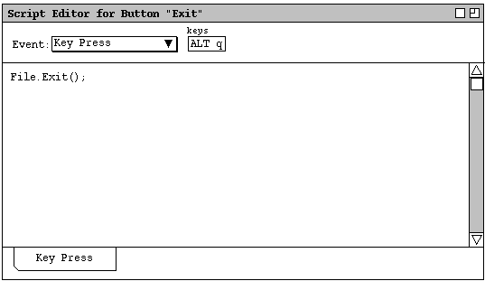
Figure 9: Script editor for key-press event.
... Explain precisely what can be entered in the `Keys' field, in
particular whether more than one keystroke is allowed, if it's UNICODE,
etc.
Any component can have scripts, not just buttons and menu items. If a
component has a built-in action for a particular event, the user has the option
to select whether or when the built-in action occurs. For example, Figure 10
shows the case where the user is defining a script for `Left Mouse
Down' on a text component.
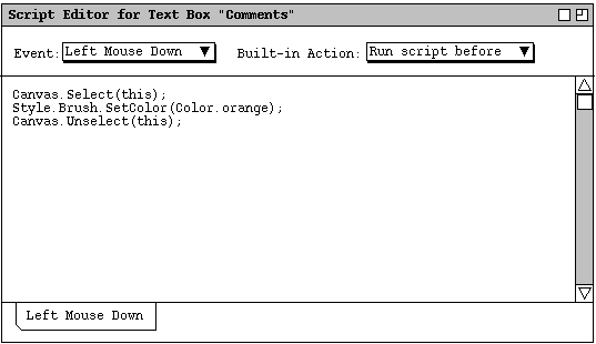
Figure 10: Script editor with built-in script field.
Since text components have a built-in action for left mouse down, namely select
a text position, the user must choose whether that built-in action is to occur.
When there is a built-in action for a selected event, the system adds the
`Built-in Action' combo box to the right of the `Event'
combobox. The selections are
Override
Run script before
Run script after
`Override' means the user-defined script completely overrides the
built-in action, that is, the built-in action does not occur.
`Override' is the default selection. `Run Before' means the
user-defined script is run first, and then the built-in action is applied.
`Run After' means the built-in action is applied, then the user-
defined script is run afterwards. In the `Run Before' case, if the
script code changes the state of the component such that the built-in action is
not applicable, the built-in action will not occur. For example, if the user-
defined script deletes the component itself, the built-in action cannot be
applied.
If the `Built-in Action' combobox is present at the same time as the
`Key Press' event type is selected, the `Keys' text box
appears between the `Event' and `Built-in Action' comboboxes.
NOTE: We need to fully spell out exactly what constitutes a built-in action
and be entirely precise about the possible type of user-defined action that may
cause inapplicability of a built-in action. In particular, the normal GUI
effects performed on a component, such as highlighting a button when it's
pressed, or turning on a radio button, should probably not be considered
overridable actions. Probably the best guideline to follow here is how things
work in swing in terms of which components have built-in listeners and what
those listeners do. In the case of what user actions cause a built-in action
to become inapplicable we can hopefully we handle it with a few general cases,
starting with component deletion.
Elimination of the Sensitize Tool
We can achieve the same effect as sensitization using a transparent button, as
is done in HyperCard. That is, to make any drawn shape appear to be
sensitized, place a button over it, set both the fill and pen of the button to
`None', and set the button's label to the empty string. Then write
the script for the button as normal.
Fully transparent components can be selected on the canvas using the normal
multi-component selection function, `Edit->Select All', or from the
component explorer.
As a test of implementation feasibility, I confirmed that a Java button can be
fully transparent and still work. The specific Java implementation to make a
JButton named "button" fully transparent is the following:
button.setOpaque(false);     // User action is setting Fill to None
button.setBorder(null);      // User action is setting Brush to None
button.setText(null);        // User action is setting label to empty
Accessing Canvas-Wide Methods in Scripts
There is a Canvas class defined with static scripting methods that
apply to the currently selected canvas. The methods are:
GetLastEvent
GetSelection
...